Chen Yu Pan


Futures Trading Revamp
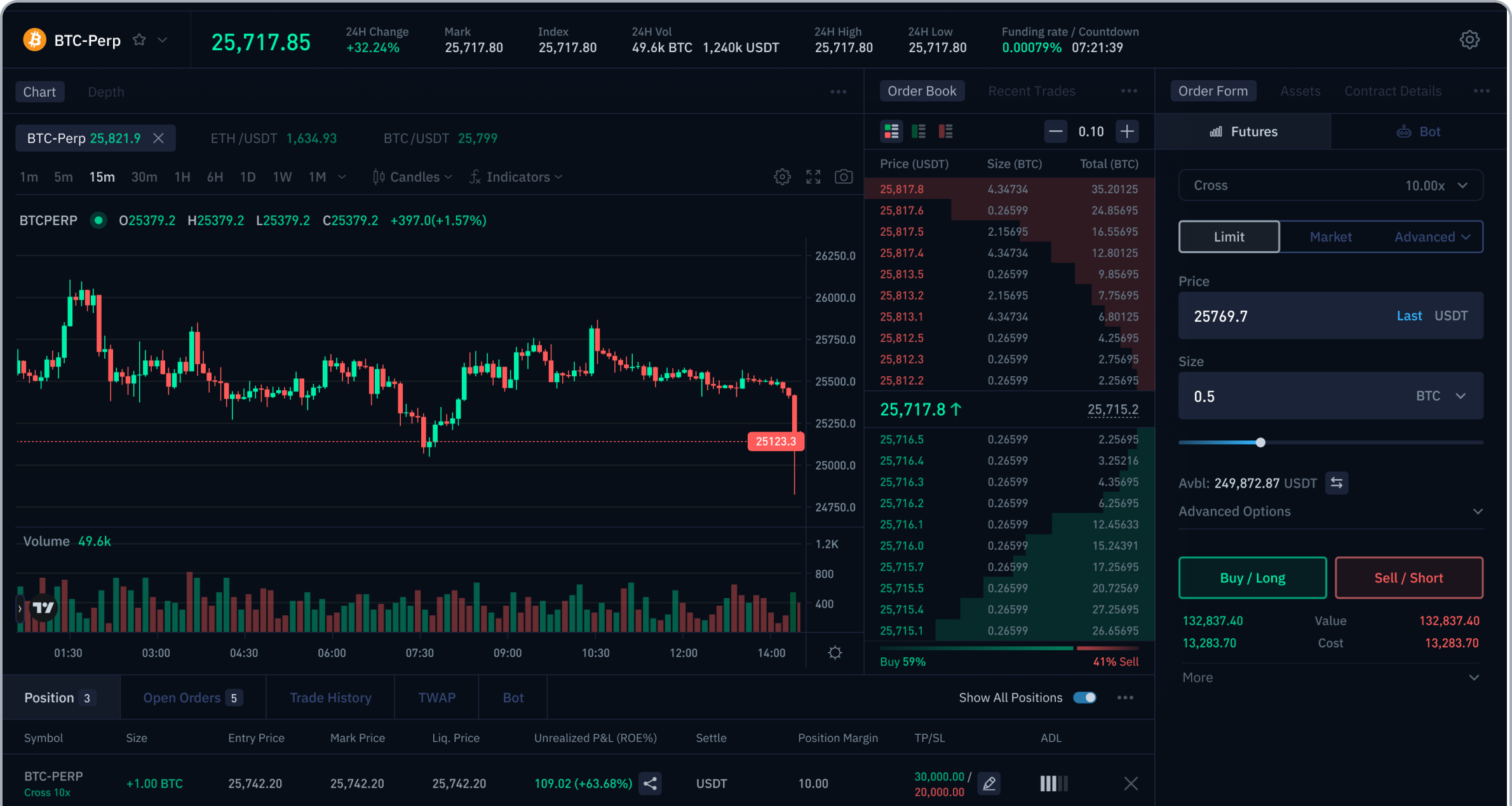
A high density trading interface needs to support fast decisions without making every control compete for attention. This concept turns scattered feedback into information priorities, a focused order form and reusable visual rules.
Role
Main Product Designer
Scope
Desktop Web Trading UI
Timeline
2 weeks
From scattered comments to 3 design priorities
A survey with casual crypto users surfaced feedback on readability, navigation and order entry. Recurring issues formed three priorities for the redesign.
“This UI looks straight out of the 70s.”
Survey Response by a Casual Crypto Trader
Hierarchy
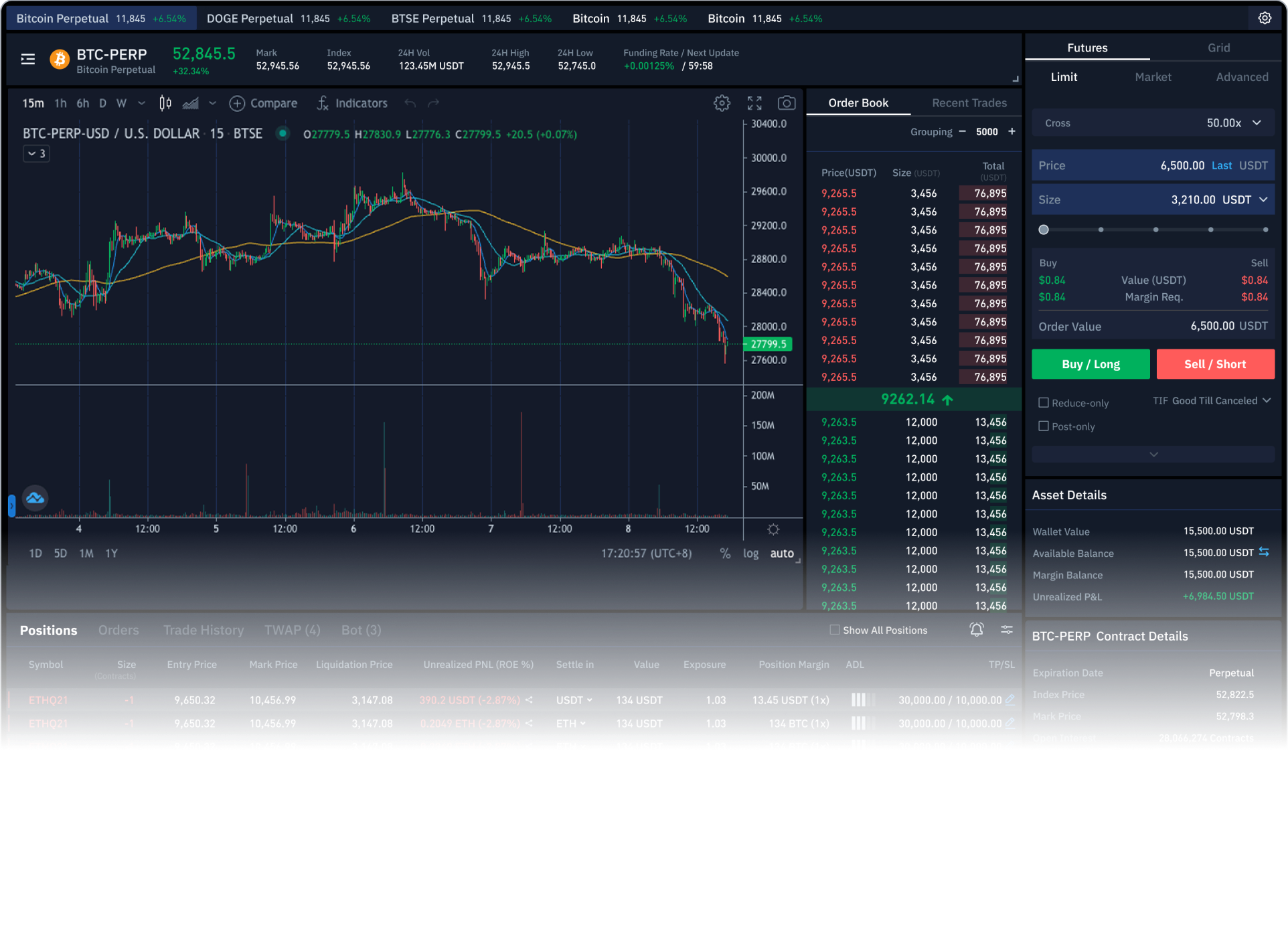
Bright, bold text and unclear tab levels made primary and secondary information compete.
Contrast
Subtle boundaries made fields and interactive surfaces difficult to identify.
Structure
Uneven spacing, inconsistent type sizes and fragmented panels made the page feel unbalanced.
Keep the data. Reduce the distraction.
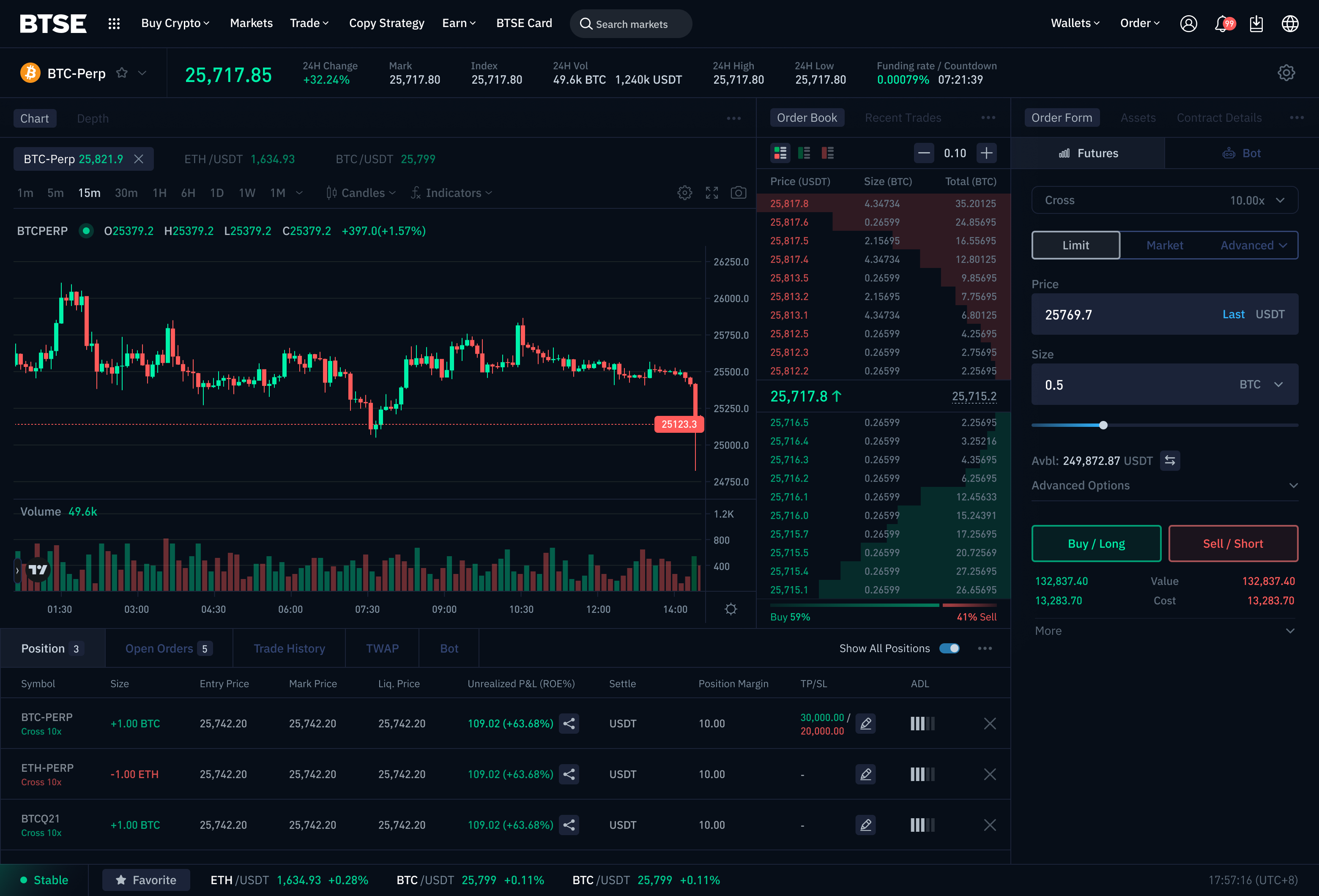
The redesign preserves the market, order and position data professional traders need. Shared surfaces, dividers and visual emphasis organize the dense interface for scanning.
Group related panels
Use dividers and shared surfaces to group related functions.
Distinct information roles
Reserve high contrast for prices, inputs and active states.
Consistent tabs
Separate primary and secondary navigation by size and emphasis.
Focused overlays
De-emphasize the background when menus or dialogs take over the task.
Keep the trade in focus
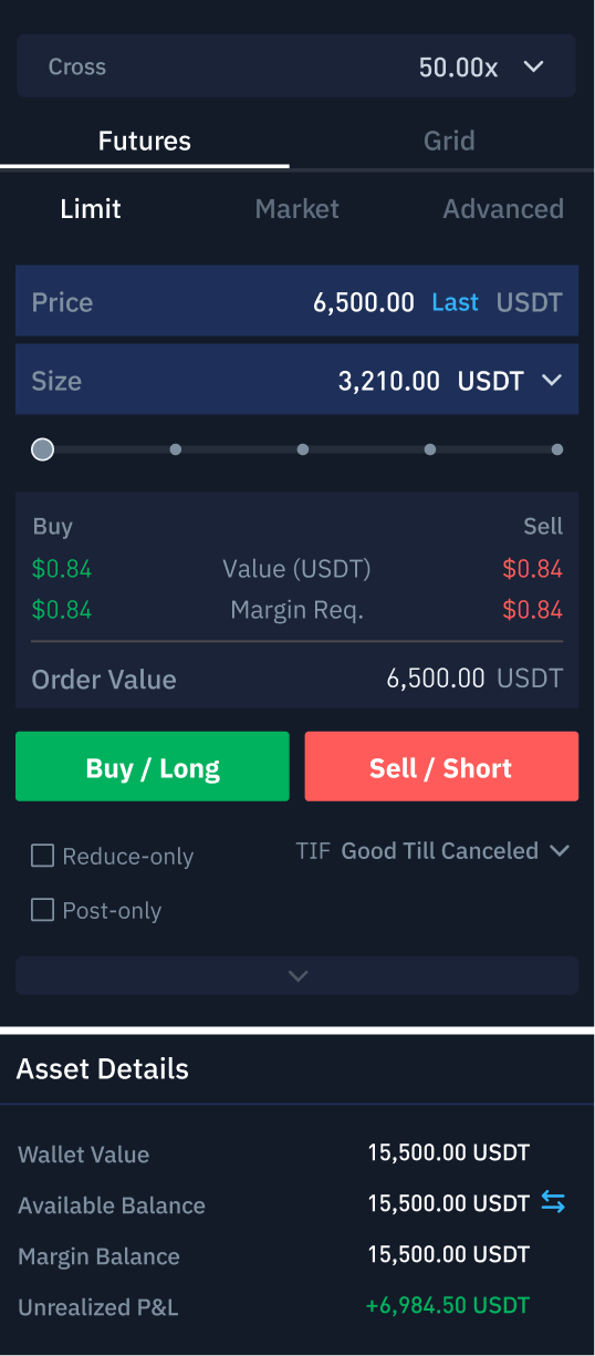
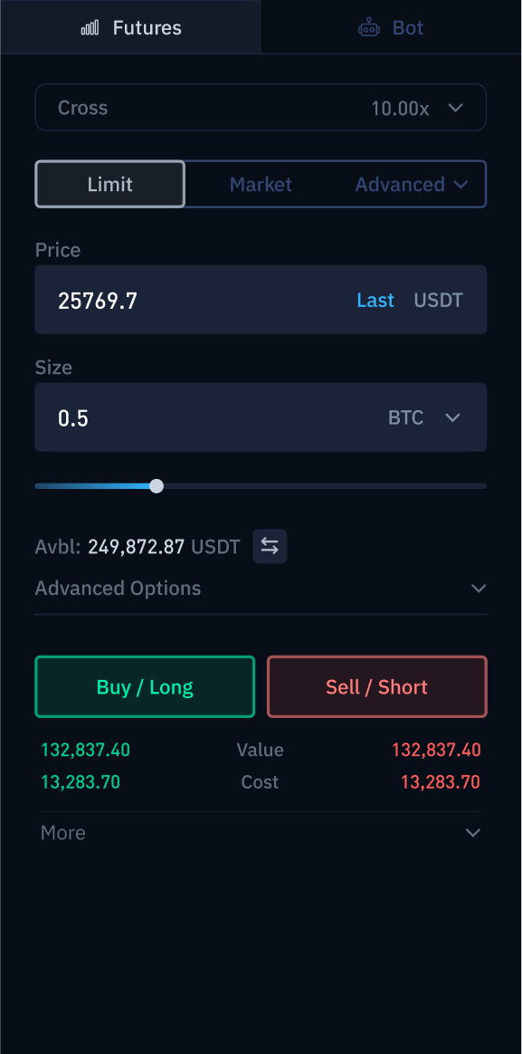
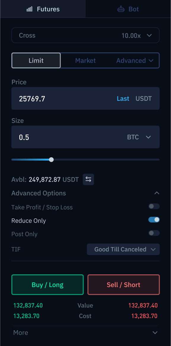
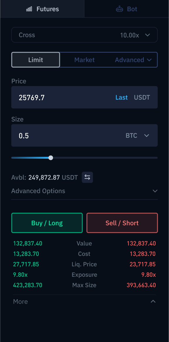
The final concept keeps the main trading decision visible and groups secondary settings inside a collapsed Advanced Options panel. The order form follows the trading sequence: select an order type, enter price and size, review the available balance, then choose Buy or Sell. This keeps the primary path compact while preserving access to occasional controls.
Before
After
A visual system that guides attention
A deep background supports text visibility, while an expanded text palette distinguishes information by importance. Muted buttons and controls reduce visual noise; buy and sell colors are adjusted to increase contrast against the background.
Text colors mapped to information roles
Previously, price inputs, focused tabs and position prices shared white, supporting information shared only two grey tones. The revised palette gives these roles distinct levels of emphasis while keeping green and red dedicated to trading direction.
Before
Three shared tones
Price Input
Focused Tab Title
Position / Order Price
Table Head
Primary Description
Secondary Description
Section Title
Default Tab Title
#FFFFFF
#FFFFFF
#FFFFFF
#7E8F9F
#7E8F9F
#5E6C7C
#5E6C7C
#5E6C7C
Before
Buy and sell signals blended into the background
1,000 Buy / Long
1,000 Sell / Short
#00B15D
#FF5B5A
After
Expanded information levels
Price Input
Focused Tab Title
Position / Order Price
Table Head
Primary Description
Secondary Description
Section Title
Default Tab Title
#FFFFFF
#CBD6E1
#B1BBC5
#7E8F9F
#5E6C7B
#4C5763
#2C3447
#334573
After
Background and trading colors create distinct buy / sell signals
1,000 Buy / Long
1,000 Sell / Short
#00CC8F
#FF5B5A
Tabs that reflect the task
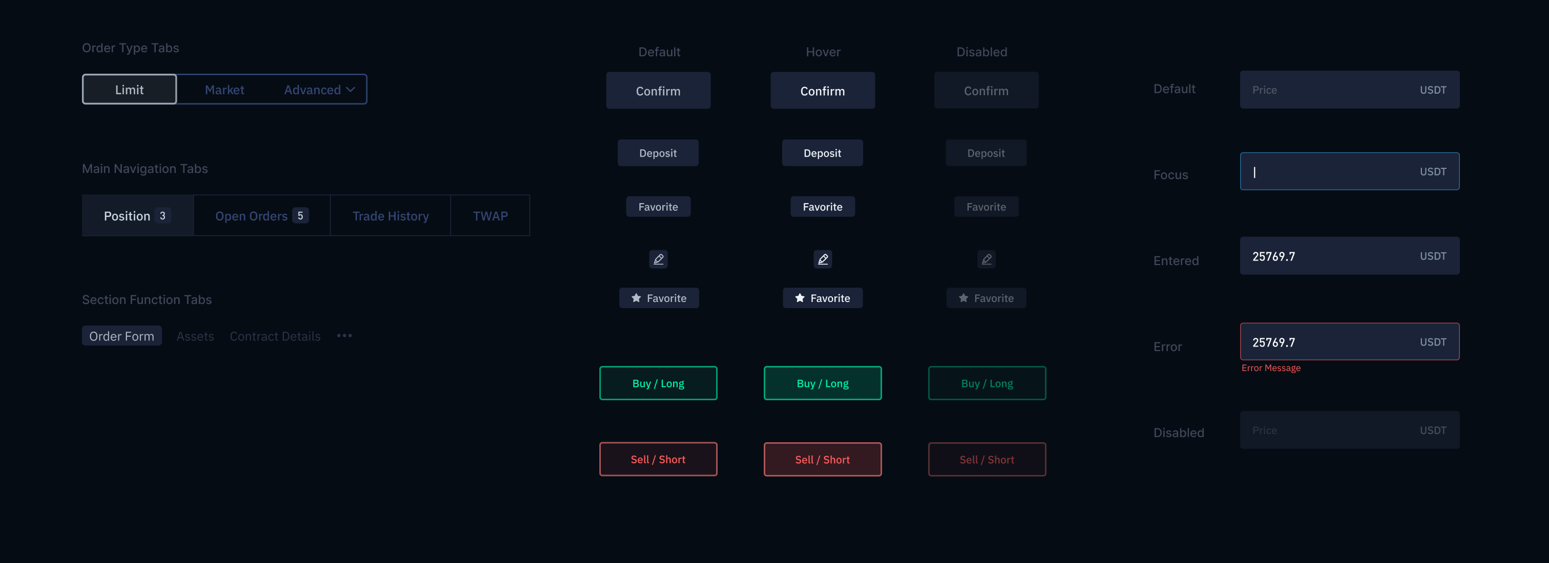
Order type tabs receive the strongest emphasis. Main navigation uses larger type and spacing, lower frequency function tabs stay quieter.
Muted components
Subdued colors on buttons and controls reduce visual noise, keeping attention on trading information.
Component states
Default, focus, entered, error and disabled states remain distinct within the muted palette.
Every visual choice serves the trade.
The concept established a shared principle for the trading interface: visual emphasis follows the importance of the decision. Information hierarchy, order entry and component colors work together to keep essential inputs in focus while preserving access to supporting details.
An interactive prototype enabled stakeholder review and feedback. Initial responses were positive, highlighting the muted palette, distinct information hierarchy, and prominent price and size fields.
Synthesis
Turned subjective comments into a usable design framework.
Clarity
Reorganized a complex order form around the main trading decision.
Consistency
Defined reusable visual and interaction rules across the screen.
View interactive prototype
More case studies?

Let’s work together.


Futures Trading Revamp
A high density trading interface needs to support fast decisions without making every control compete for attention. This concept turns scattered feedback into information priorities, a focused order form and reusable visual rules.
Role
Main Product Designer
Scope
Desktop Web Trading UI
Timeline
2 weeks
From scattered comments to 3 design priorities
A survey with casual crypto users surfaced feedback on readability, navigation and order entry. Recurring issues formed three priorities for the redesign.
“This UI looks straight out of the 70s.”
Survey Response by a Casual Crypto Trader
Hierarchy
Bright, bold text and unclear tab levels made primary and secondary information compete.
Contrast
Subtle boundaries made fields and interactive surfaces difficult to identify.
Structure
Uneven spacing, inconsistent type sizes and fragmented panels made the page feel unbalanced.
Keep the data. Reduce the distraction.
The redesign preserves the market, order and position data professional traders need. Shared surfaces, dividers and visual emphasis organize the dense interface for scanning.
Group related panels
Use dividers and shared surfaces to group related functions.
Distinct information roles
Reserve high contrast for prices, inputs and active states.
Consistent tabs
Separate primary and secondary navigation by size and emphasis.
Focused overlays
De-emphasize the background when menus or dialogs take over the task.
Keep the trade in focus
The final concept keeps the main trading decision visible and groups secondary settings inside a collapsed Advanced Options panel. The order form follows the trading sequence: select an order type, enter price and size, review the available balance, then choose Buy or Sell. This keeps the primary path compact while preserving access to occasional controls.
Before
After
A visual system that guides attention
A deep background supports text visibility, while an expanded text palette distinguishes information by importance. Muted buttons and controls reduce visual noise; buy and sell colors are adjusted to increase contrast against the background.
Text colors mapped to information roles
Previously, price inputs, focused tabs and position prices shared white, supporting information shared only two grey tones. The revised palette gives these roles distinct levels of emphasis while keeping green and red dedicated to trading direction.
Before
Three shared tones
Price Input
Focused Tab Title
Position / Order Price
Table Head
Primary Description
Secondary Description
Section Title
Default Tab Title
#FFFFFF
#FFFFFF
#FFFFFF
#7E8F9F
#7E8F9F
#5E6C7C
#5E6C7C
#5E6C7C
Before
Buy and sell signals blended into the background
1,000 Buy / Long
1,000 Sell / Short
#00B15D
#FF5B5A
After
Expanded information levels
Price Input
Focused Tab Title
Position / Order Price
Table Head
Primary Description
Secondary Description
Section Title
Default Tab Title
#FFFFFF
#CBD6E1
#B1BBC5
#7E8F9F
#5E6C7B
#4C5763
#2C3447
#334573
After
Background and trading colors create distinct buy / sell signals
1,000 Buy / Long
1,000 Sell / Short
#00CC8F
#FF5B5A
Tabs that reflect the task
Order type tabs receive the strongest emphasis. Main navigation uses larger type and spacing, lower frequency function tabs stay quieter.
Muted components
Subdued colors on buttons and controls reduce visual noise, keeping attention on trading information.
Component states
Default, focus, entered, error and disabled states remain distinct within the muted palette.
Every visual choice serves the trade.
The concept established a shared principle for the trading interface: visual emphasis follows the importance of the decision. Information hierarchy, order entry and component colors work together to keep essential inputs in focus while preserving access to supporting details.
An interactive prototype enabled stakeholder review and feedback. Initial responses were positive, highlighting the muted palette, distinct information hierarchy, and prominent price and size fields.
Synthesis
Turned subjective comments into a usable design framework.
Clarity
Reorganized a complex order form around the main trading decision.
Consistency
Defined reusable visual and interaction rules across the screen.
View interactive prototype
More case studies?
Let’s work together.
Futures Trading Revamp
A high density trading interface needs to support fast decisions without making every control compete for attention. This concept turns scattered feedback into information priorities, a focused order form and reusable visual rules.
Role
Main Product Designer
Scope
Desktop Web Trading UI
Timeline
2 weeks
From scattered comments to 3 design priorities
A survey with casual crypto users surfaced feedback on readability, navigation and order entry. Recurring issues formed three priorities for the redesign.
“This UI looks straight out of the 70s.”
Survey Response by a Casual Crypto Trader
Hierarchy
Bright, bold text and unclear tab levels made primary and secondary information compete.
Contrast
Subtle boundaries made fields and interactive surfaces difficult to identify.
Structure
Uneven spacing, inconsistent type sizes and fragmented panels made the page feel unbalanced.
Keep the data. Reduce the distraction.
The redesign preserves the market, order and position data professional traders need. Shared surfaces, dividers and visual emphasis organize the dense interface for scanning.
Group related panels
Use dividers and shared surfaces to group related functions.
Distinct information roles
Reserve high contrast for prices, inputs and active states.
Consistent tabs
Separate primary and secondary navigation by size and emphasis.
Focused overlays
De-emphasize the background when menus or dialogs take over the task.
Keep the trade in focus
The final concept keeps the main trading decision visible and groups secondary settings inside a collapsed Advanced Options panel. The order form follows the trading sequence: select an order type, enter price and size, review the available balance, then choose Buy or Sell. This keeps the primary path compact while preserving access to occasional controls.
Before
After
Default
Advanced trading options expanded
Order details expanded
A visual system that guides attention
A deep background supports text visibility, while an expanded text palette distinguishes information by importance. Muted buttons and controls reduce visual noise; buy and sell colors are adjusted to increase contrast against the background.
Text colors mapped to information roles
Previously, price inputs, focused tabs and position prices shared white, supporting information shared only two grey tones. The revised palette gives these roles distinct levels of emphasis while keeping green and red dedicated to trading direction.
Before
Three shared tones
Price Input
Focused Tab Title
Position / Order Price
Table Head
Primary Description
Secondary Description
Section Title
Default Tab Title
#FFFFFF
#FFFFFF
#FFFFFF
#7E8F9F
#7E8F9F
#5E6C7C
#5E6C7C
#5E6C7C
Before
Buy and sell signals blended into the background
1,000 Buy / Long
1,000 Sell / Short
#00B15D
#FF5B5A
After
Expanded information levels
Price Input
Focused Tab Title
Position / Order Price
Table Head
Primary Description
Secondary Description
Section Title
Default Tab Title
#FFFFFF
#CBD6E1
#B1BBC5
#7E8F9F
#5E6C7B
#4C5763
#2C3447
#334573
After
Background and trading colors create distinct buy / sell signals
1,000 Buy / Long
1,000 Sell / Short
#00CC8F
#FF5B5A
Tabs that reflect the task
Order type tabs receive the strongest emphasis. Main navigation uses larger type and spacing, lower frequency function tabs stay quieter.
Muted components
Subdued colors on buttons and controls reduce visual noise, keeping attention on trading information.
Component states
Default, focus, entered, error and disabled states remain distinct within the muted palette.
Every visual choice serves the trade.
The concept established a shared principle for the trading interface: visual emphasis follows the importance of the decision. Information hierarchy, order entry and component colors work together to keep essential inputs in focus while preserving access to supporting details.
An interactive prototype enabled stakeholder review and feedback. Initial responses were positive, highlighting the muted palette, distinct information hierarchy, and prominent price and size fields.
Synthesis
Turned subjective comments into a usable design framework.
Clarity
Reorganized a complex order form around the main trading decision.
Consistency
Defined reusable visual and interaction rules across the screen.
View interactive prototype
More case studies?
Let’s work together.
Futures Trading Revamp
A high density trading interface needs to support fast decisions without making every control compete for attention. This concept turns scattered feedback into information priorities, a focused order form and reusable visual rules.
Role
Main Product Designer
Scope
Desktop Web Trading UI
Timeline
2 weeks
From scattered comments to 3 design priorities
A survey with casual crypto users surfaced feedback on readability, navigation and order entry. Recurring issues formed three priorities for the redesign.
“This UI looks straight out of the 70s.”
Survey Response by a Casual Crypto Trader
Hierarchy
Bright, bold text and unclear tab levels made primary and secondary information compete.
Contrast
Subtle boundaries made fields and interactive surfaces difficult to identify.
Structure
Uneven spacing, inconsistent type sizes and fragmented panels made the page feel unbalanced.
Keep the data. Reduce the distraction.
The redesign preserves the market, order and position data professional traders need. Shared surfaces, dividers and visual emphasis organize the dense interface for scanning.
Group related panels
Use dividers and shared surfaces to group related functions.
Distinct information roles
Reserve high contrast for prices, inputs and active states.
Consistent tabs
Separate primary and secondary navigation by size and emphasis.
Focused overlays
De-emphasize the background when menus or dialogs take over the task.
Keep the trade in focus
The final concept keeps the main trading decision visible and groups secondary settings inside a collapsed Advanced Options panel. The order form follows the trading sequence: select an order type, enter price and size, review the available balance, then choose Buy or Sell. This keeps the primary path compact while preserving access to occasional controls.
Before
After
Default
Advanced trading options expanded
Order details expanded
A visual system that guides attention
A deep background supports text visibility, while an expanded text palette distinguishes information by importance. Muted buttons and controls reduce visual noise; buy and sell colors are adjusted to increase contrast against the background.
Text colors mapped to information roles
Previously, price inputs, focused tabs and position prices shared white, supporting information shared only two grey tones. The revised palette gives these roles distinct levels of emphasis while keeping green and red dedicated to trading direction.
Before
Three shared tones
Price Input
Focused Tab Title
Position / Order Price
Table Head
Primary Description
Secondary Description
Section Title
Default Tab Title
#FFFFFF
#FFFFFF
#FFFFFF
#7E8F9F
#7E8F9F
#5E6C7C
#5E6C7C
#5E6C7C
Before
Buy and sell signals blended into the background
1,000 Buy / Long
1,000 Sell / Short
#00B15D
#FF5B5A
After
Expanded information levels
Price Input
Focused Tab Title
Position / Order Price
Table Head
Primary Description
Secondary Description
Section Title
Default Tab Title
#FFFFFF
#CBD6E1
#B1BBC5
#7E8F9F
#5E6C7B
#4C5763
#2C3447
#334573
After
Background and trading colors create distinct buy / sell signals
1,000 Buy / Long
1,000 Sell / Short
#00CC8F
#FF5B5A
Tabs that reflect the task
Order type tabs receive the strongest emphasis. Main navigation uses larger type and spacing, lower frequency function tabs stay quieter.
Muted components
Subdued colors on buttons and controls reduce visual noise, keeping attention on trading information.
Component states
Default, focus, entered, error and disabled states remain distinct within the muted palette.
Every visual choice serves the trade.
The concept established a shared principle for the trading interface: visual emphasis follows the importance of the decision. Information hierarchy, order entry and component colors work together to keep essential inputs in focus while preserving access to supporting details.
An interactive prototype enabled stakeholder review and feedback. Initial responses were positive, highlighting the muted palette, distinct information hierarchy, and prominent price and size fields.
Synthesis
Turned subjective comments into a usable design framework.
Clarity
Reorganized a complex order form around the main trading decision.
Consistency
Defined reusable visual and interaction rules across the screen.
View interactive prototype
More case studies?
Let’s work together.
Futures Trading Revamp
A high density trading interface needs to support fast decisions without making every control compete for attention. This concept turns scattered feedback into information priorities, a focused order form and reusable visual rules.
Role
Main Product Designer
Scope
Desktop Web Trading UI
Timeline
2 weeks
From scattered comments to 3 design priorities
A survey with casual crypto users surfaced feedback on readability, navigation and order entry. Recurring issues formed three priorities for the redesign.
“This UI looks straight out of the 70s.”
Survey Response by a Casual Crypto Trader
Hierarchy
Bright, bold text and unclear tab levels made primary and secondary information compete.
Contrast
Subtle boundaries made fields and interactive surfaces difficult to identify.
Structure
Uneven spacing, inconsistent type sizes and fragmented panels made the page feel unbalanced.
Keep the data. Reduce the distraction.
The redesign preserves the market, order and position data professional traders need. Shared surfaces, dividers and visual emphasis organize the dense interface for scanning.
Group related panels
Use dividers and shared surfaces to group related functions.
Distinct information roles
Reserve high contrast for prices, inputs and active states.
Consistent tabs
Separate primary and secondary navigation by size and emphasis.
Focused overlays
De-emphasize the background when menus or dialogs take over the task.
Keep the trade in focus
The final concept keeps the main trading decision visible and groups secondary settings inside a collapsed Advanced Options panel. The order form follows the trading sequence: select an order type, enter price and size, review the available balance, then choose Buy or Sell. This keeps the primary path compact while preserving access to occasional controls.
Before
After
Default
Advanced trading options expanded
Order details expanded
A visual system that guides attention
A deep background supports text visibility, while an expanded text palette distinguishes information by importance. Muted buttons and controls reduce visual noise; buy and sell colors are adjusted to increase contrast against the background.
Text colors mapped to information roles
Previously, price inputs, focused tabs and position prices shared white, supporting information shared only two grey tones. The revised palette gives these roles distinct levels of emphasis while keeping green and red dedicated to trading direction.
Before
Three shared tones
Price Input
Focused Tab Title
Position / Order Price
Table Head
Primary Description
Secondary Description
Section Title
Default Tab Title
#FFFFFF
#FFFFFF
#FFFFFF
#7E8F9F
#7E8F9F
#5E6C7C
#5E6C7C
#5E6C7C
Before
Buy and sell signals blended into the background
1,000 Buy / Long
1,000 Sell / Short
#00B15D
#FF5B5A
After
Expanded information levels
Price Input
Focused Tab Title
Position / Order Price
Table Head
Primary Description
Secondary Description
Section Title
Default Tab Title
#FFFFFF
#CBD6E1
#B1BBC5
#7E8F9F
#5E6C7B
#4C5763
#2C3447
#334573
After
Background and trading colors create distinct buy / sell signals
1,000 Buy / Long
1,000 Sell / Short
#00CC8F
#FF5B5A
Tabs that reflect the task
Order type tabs receive the strongest emphasis. Main navigation uses larger type and spacing, lower frequency function tabs stay quieter.
Muted components
Subdued colors on buttons and controls reduce visual noise, keeping attention on trading information.
Component states
Default, focus, entered, error and disabled states remain distinct within the muted palette.
Every visual choice serves the trade.
The concept established a shared principle for the trading interface: visual emphasis follows the importance of the decision. Information hierarchy, order entry and component colors work together to keep essential inputs in focus while preserving access to supporting details.
An interactive prototype enabled stakeholder review and feedback. Initial responses were positive, highlighting the muted palette, distinct information hierarchy, and prominent price and size fields.
Synthesis
Turned subjective comments into a usable design framework.
Clarity
Reorganized a complex order form around the main trading decision.
Consistency
Defined reusable visual and interaction rules across the screen.
View interactive prototype
More case studies?
Let’s work together.