Chen Yu Pan


Card management across providers.
Designing a shared plan-and-card structure for consumer and enterprise use, then simplifying it as the product evolved.
Role
Sole Designer
Platform
Web
Scope
Product Architecture · Consumer + Enterprise Solution
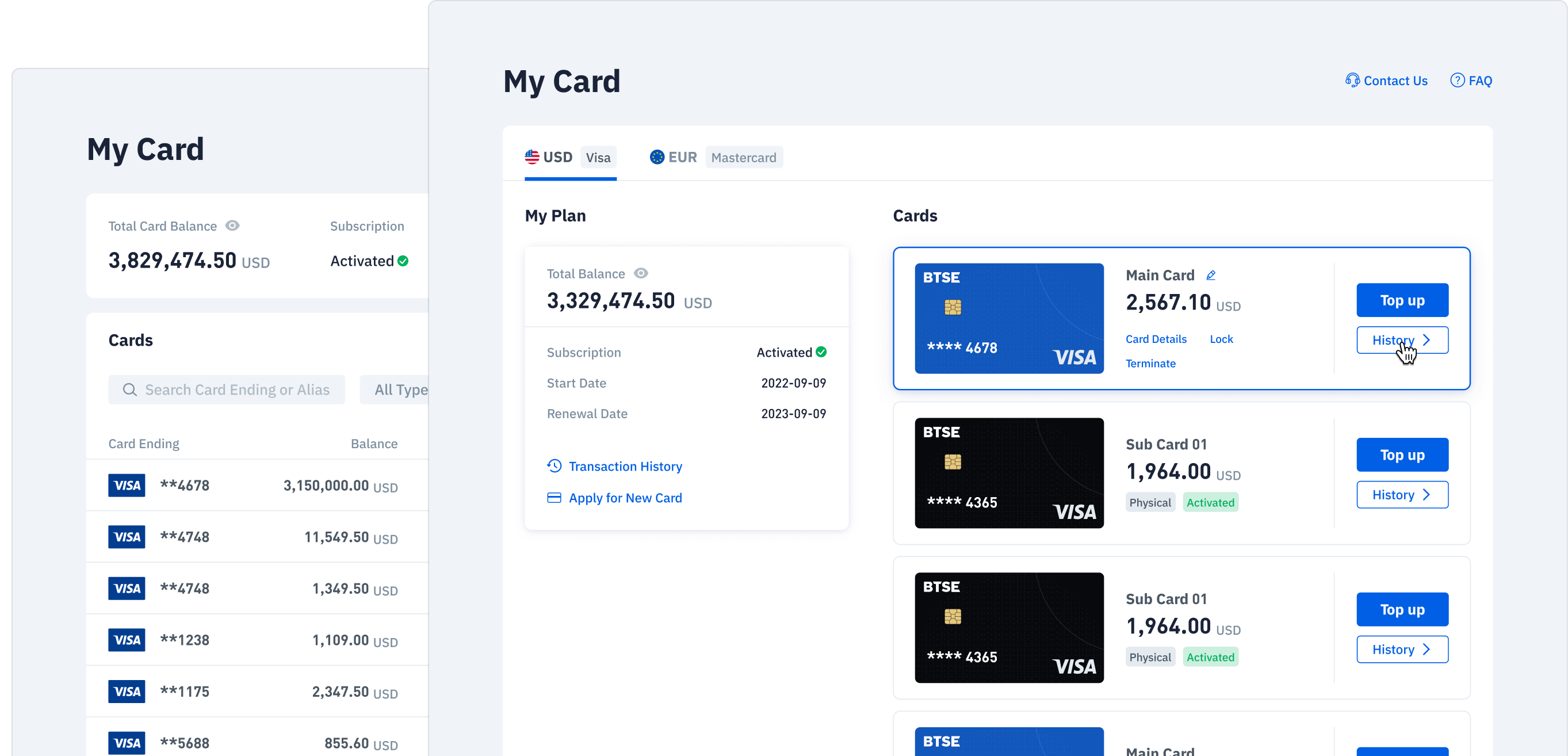
One product. Different rules.
A plan groups cards under one provider. I kept this structure familiar, while placing balances and funding actions at the level each provider required.

Visa · Separate Card Balances
Each card has its own balance and Top Up action. A plan-wide total does not replace the balance of an individual card.

Mastercard · Shared Card Balances
Cards share a balance at plan level. Repeating balance controls on every card would misrepresent how the plan works.
The design challenge: preserve a familiar management structure while making each provider’s rules explicit.
Put action at the right level
I organized management around a shared plan and card hierarchy, then located balances and actions according to each provider’s rules.
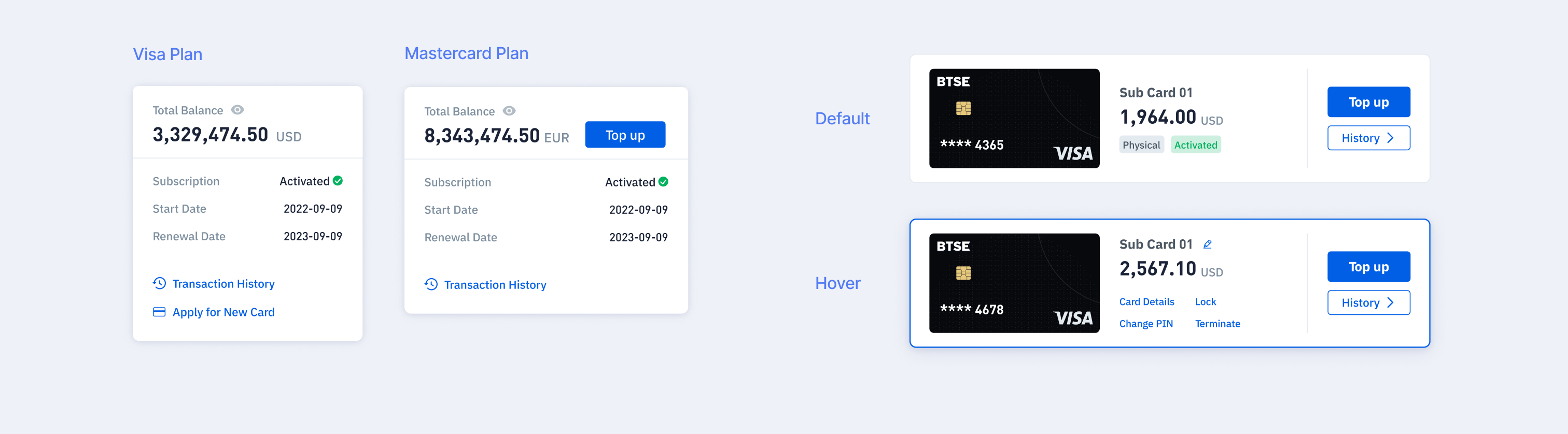
Plan · The Shared Context
Review the subscription status
Apply New Card belongs to the plan
Mastercard balance and Top Up live here
Plan level Transaction History
Card · The Individual Context
Identify the card type and current status
History opens the selected card’s transactions
Visa balance and Top Up belong to each card
Available controls follow the card’s state

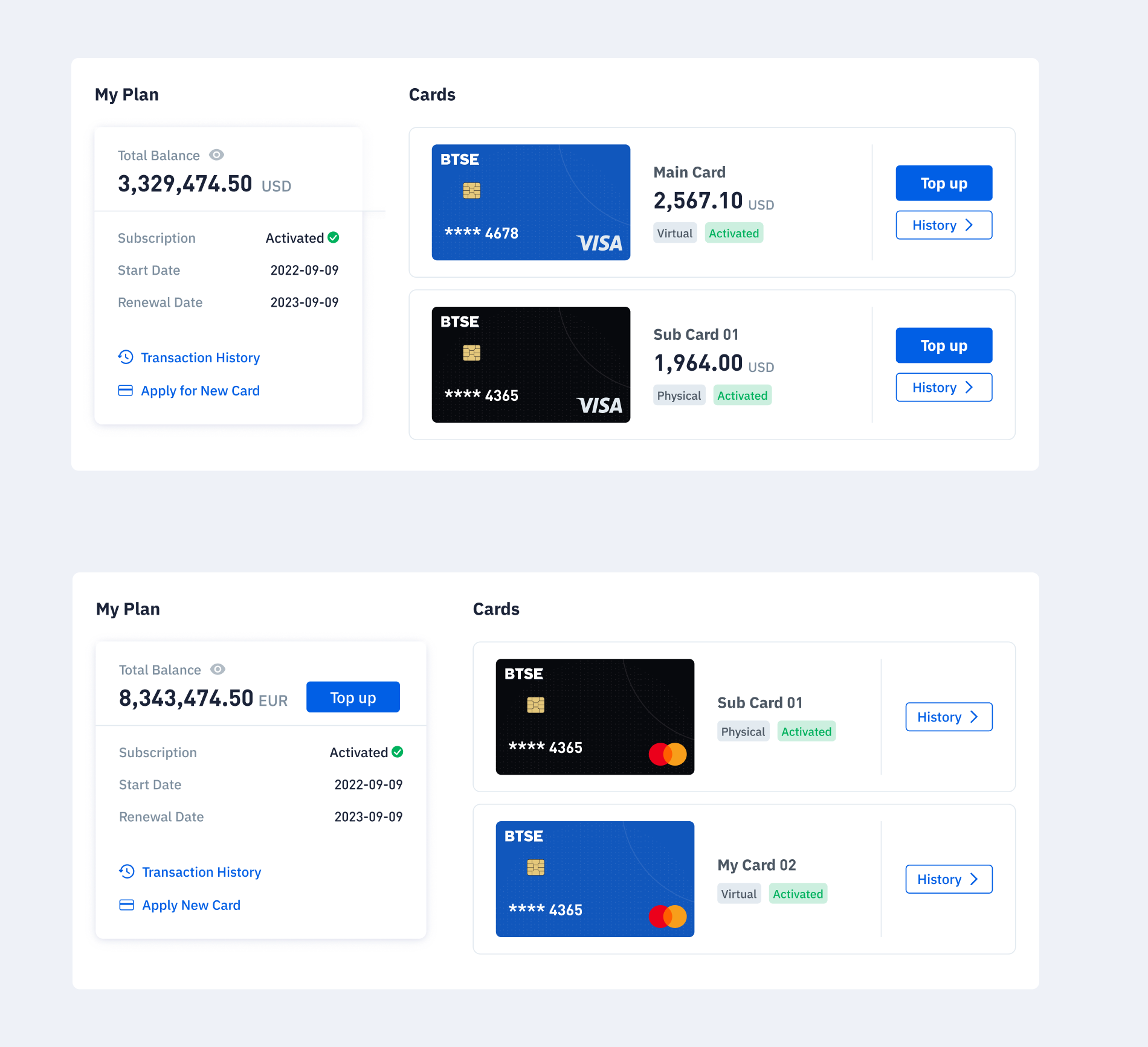
Visa Plan
Separate balances, shared navigation
Plan level Transaction History and Apply New Card sit together. Each Visa card retains its own balance, Top Up and History entry.

Mastercard Plan
One balance for the plan
Mastercard moves balance and Top Up to the plan. Individual cards retain their identity, History entry and state-dependent controls.
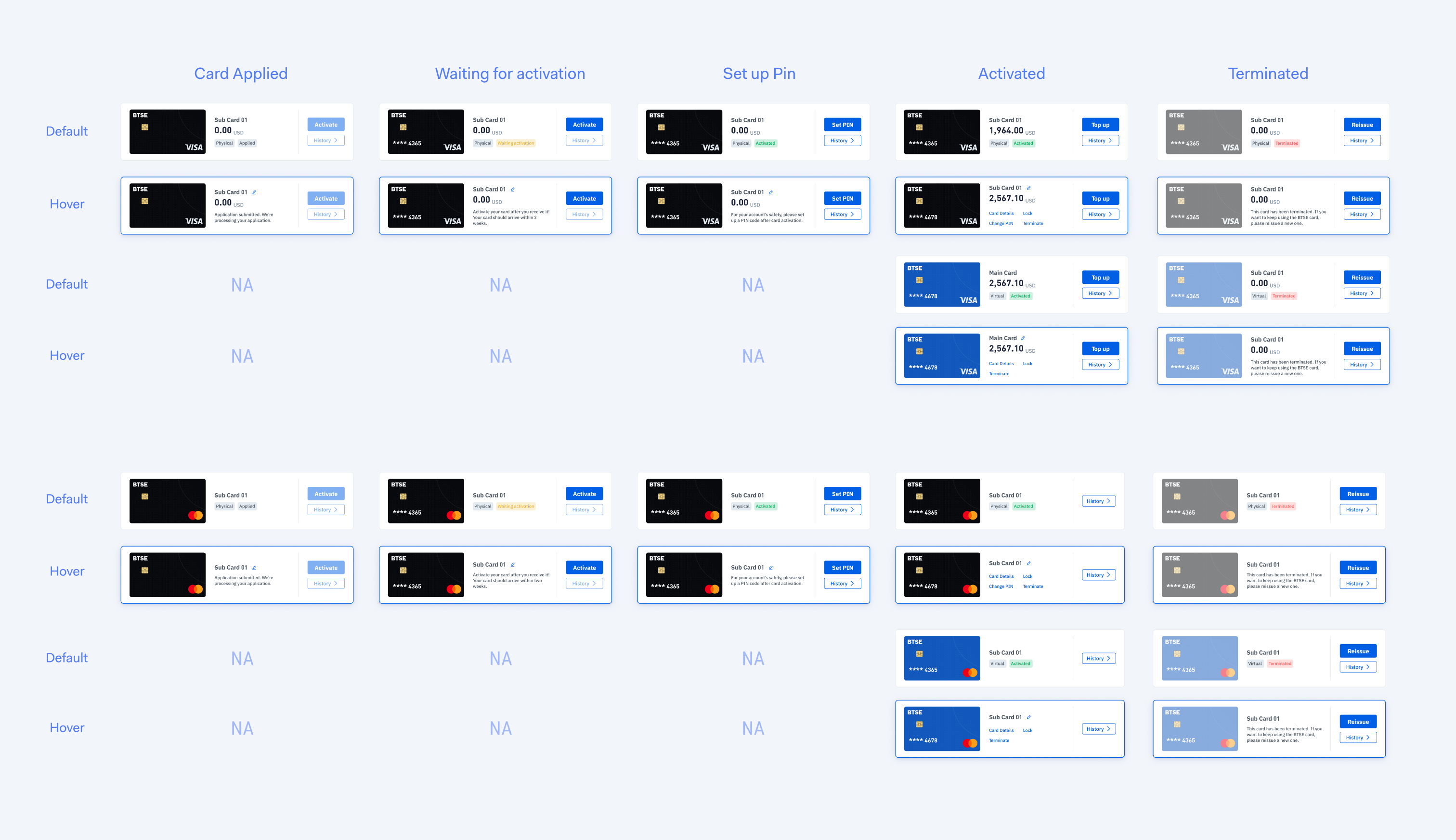
Supporting the structure across card states
I mapped the available actions for each card state, accounting for differences between physical and virtual cards, card status, and subscription status. The examples below highlight the key states, while the full state matrix covers activation, PIN setup, active, locked, error, and termination scenarios.
From a few cards to 100+
Enterprise use changed the management task: locate, compare and act on individual cards across a much larger collection.
Consumer
Visual cards support recognition and direct interaction with a small collection.
Enterprise
A searchable, filterable table supports management of 100+ cards.
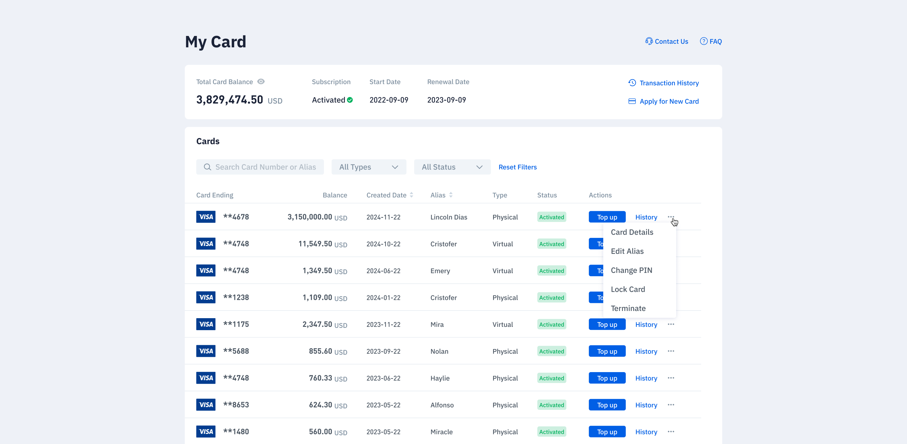
I shifted the presentation from visual cards to a table: card number, alias, dates, balance and status became scannable fields, with actions available on each row. The enterprise version was adopted by 3 clients. The 100+ figure describes the card management requirement.
Simplify as the product changes
Provider constraints, business direction and usage data changed the assumptions behind multi-card management. I translated those inputs into a simpler page hierarchy.
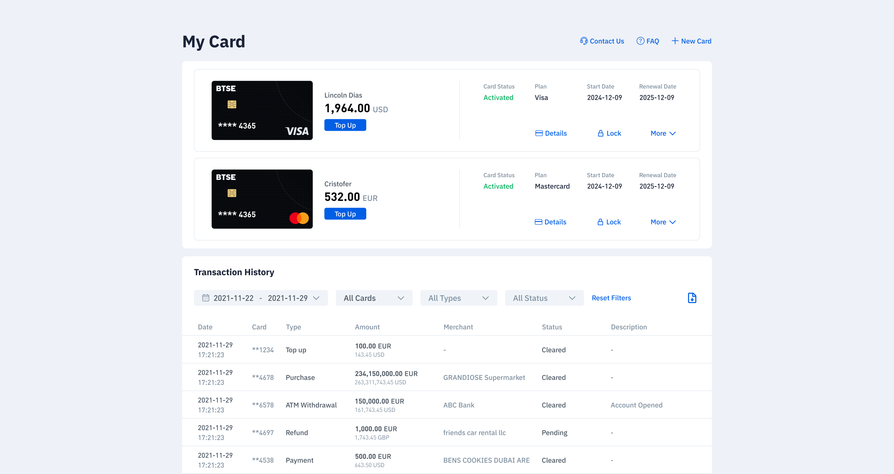
History in the Main View
Bring transaction history into the page so users can review activity alongside their cards.
A Clear Action Hierarchy
Keep Top Up, Details and Lock visible. Group infrequent controls under More.
The design response was a hierarchy change: bring daily management forward and reduce the prominence of adding more cards.
A foundation that kept adapting
The work evolved from a single provider product into a shared management system, then adapted to enterprise scale and a simpler consumer model.
01
Single Card provider
The original card management experience.
02
Multi Card provider
Shared plan and card architecture.
03
Enterprise
Searchable management for 100+ cards, adopted by approximately 2–3 clients.
04
Card Management 2.0
A simpler hierarchy for everyday use.
The key was to define what should stay consistent, then adapt the experience when provider rules, management scale or usage patterns change.
More case studies?

Let’s work together.


Card management across providers.
Designing a shared plan-and-card structure for consumer and enterprise use, then simplifying it as the product evolved.
Role
Sole Designer
Platform
Web
Scope
Product Architecture · Consumer + Enterprise Solution
One product. Different rules.
A plan groups cards under one provider. I kept this structure familiar, while placing balances and funding actions at the level each provider required.
Visa · Separate Card Balances
Each card has its own balance and Top Up action. A plan-wide total does not replace the balance of an individual card.
Mastercard · Shared Card Balances
Cards share a balance at plan level. Repeating balance controls on every card would misrepresent how the plan works.
The design challenge: preserve a familiar management structure while making each provider’s rules explicit.
Put action at the right level
I organized management around a shared plan and card hierarchy, then located balances and actions according to each provider’s rules.
Plan · The Shared Context
Review the subscription status
Apply New Card belongs to the plan
Mastercard balance and Top Up live here
Plan level Transaction History
Card · The Individual Context
Identify the card type and current status
History opens the selected card’s transactions
Visa balance and Top Up belong to each card
Available controls follow the card’s state
Visa Plan
Separate balances, shared navigation
Plan level Transaction History and Apply New Card sit together. Each Visa card retains its own balance, Top Up and History entry.
Mastercard Plan
One balance for the plan
Mastercard moves balance and Top Up to the plan. Individual cards retain their identity, History entry and state-dependent controls.
Supporting the structure across card states
I mapped the available actions for each card state, accounting for differences between physical and virtual cards, card status, and subscription status. The examples below highlight the key states, while the full state matrix covers activation, PIN setup, active, locked, error, and termination scenarios.
From a few cards to 100+
Enterprise use changed the management task: locate, compare and act on individual cards across a much larger collection.
Consumer
Visual cards support recognition and direct interaction with a small collection.
Enterprise
A searchable, filterable table supports management of 100+ cards.
I shifted the presentation from visual cards to a table: card number, alias, dates, balance and status became scannable fields, with actions available on each row. The enterprise version was adopted by 3 clients. The 100+ figure describes the card management requirement.
Simplify as the product changes
Provider constraints, business direction and usage data changed the assumptions behind multi-card management. I translated those inputs into a simpler page hierarchy.
History in the Main View
Bring transaction history into the page so users can review activity alongside their cards.
A Clear Action Hierarchy
Keep Top Up, Details and Lock visible. Group infrequent controls under More.
The design response was a hierarchy change: bring daily management forward and reduce the prominence of adding more cards.
A foundation that kept adapting
The work evolved from a single provider product into a shared management system, then adapted to enterprise scale and a simpler consumer model.
01
Single Card provider
The original card management experience.
02
Multi Card provider
Shared plan and card architecture.
03
Enterprise
Searchable management for 100+ cards, adopted by approximately 2–3 clients.
04
Card Management 2.0
A simpler hierarchy for everyday use.
The key was to define what should stay consistent, then adapt the experience when provider rules, management scale or usage patterns change.
More case studies?
Let’s work together.
Card management across providers.
Designing a shared plan-and-card structure for consumer and enterprise use, then simplifying it as the product evolved.
Role
Sole Designer
Platform
Web
Scope
Product Architecture · Consumer + Enterprise Solution
One product. Different rules.
A plan groups cards under one provider. I kept this structure familiar, while placing balances and funding actions at the level each provider required.
Visa · Separate Card Balances
Each card has its own balance and Top Up action. A plan-wide total does not replace the balance of an individual card.
Mastercard · Shared Card Balances
Cards share a balance at plan level. Repeating balance controls on every card would misrepresent how the plan works.
The design challenge: preserve a familiar management structure while making each provider’s rules explicit.
Put action at the right level
I organized management around a shared plan and card hierarchy, then located balances and actions according to each provider’s rules.
Plan · The Shared Context
Review the subscription status
Apply New Card belongs to the plan
Mastercard balance and Top Up live here
Plan level Transaction History
Card · The Individual Context
Identify the card type and current status
History opens the selected card’s transactions
Visa balance and Top Up belong to each card
Available controls follow the card’s state
Visa Plan
Separate balances, shared navigation
Plan level Transaction History and Apply New Card sit together. Each Visa card retains its own balance, Top Up and History entry.
Mastercard Plan
One balance for the plan
Mastercard moves balance and Top Up to the plan. Individual cards retain their identity, History entry and state-dependent controls.
Supporting the structure across card states
I mapped the available actions for each card state, accounting for differences between physical and virtual cards, card status, and subscription status. The examples below highlight the key states, while the full state matrix covers activation, PIN setup, active, locked, error, and termination scenarios.
From a few cards to 100+
Enterprise use changed the management task: locate, compare and act on individual cards across a much larger collection.
Consumer
Visual cards support recognition and direct interaction with a small collection.
Enterprise
A searchable, filterable table supports management of 100+ cards.
I shifted the presentation from visual cards to a table: card number, alias, dates, balance and status became scannable fields, with actions available on each row. The enterprise version was adopted by 3 clients. The 100+ figure describes the card management requirement.
Simplify as the product changes
Provider constraints, business direction and usage data changed the assumptions behind multi-card management. I translated those inputs into a simpler page hierarchy.
History in the Main View
Bring transaction history into the page so users can review activity alongside their cards.
A Clear Action Hierarchy
Keep Top Up, Details and Lock visible. Group infrequent controls under More.
The design response was a hierarchy change: bring daily management forward and reduce the prominence of adding more cards.
A foundation that kept adapting
The work evolved from a single provider product into a shared management system, then adapted to enterprise scale and a simpler consumer model.
01
Single Card provider
The original card management experience.
02
Multi Card provider
Shared plan and card architecture.
03
Enterprise
Searchable management for 100+ cards, adopted by approximately 2–3 clients.
04
Card Management 2.0
A simpler hierarchy for everyday use.
The key was to define what should stay consistent, then adapt the experience when provider rules, management scale or usage patterns change.
More case studies?
Let’s work together.
Card management across providers.
Designing a shared plan-and-card structure for consumer and enterprise use, then simplifying it as the product evolved.
Role
Sole Designer
Platform
Web
Scope
Product Architecture · Consumer + Enterprise Solution
One product. Different rules.
A plan groups cards under one provider. I kept this structure familiar, while placing balances and funding actions at the level each provider required.
Visa · Separate Card Balances
Each card has its own balance and Top Up action. A plan-wide total does not replace the balance of an individual card.
Mastercard · Shared Card Balances
Cards share a balance at plan level. Repeating balance controls on every card would misrepresent how the plan works.
The design challenge: preserve a familiar management structure while making each provider’s rules explicit.
Put action at the right level
I organized management around a shared plan and card hierarchy, then located balances and actions according to each provider’s rules.
Plan · The Shared Context
Review the subscription status
Apply New Card belongs to the plan
Mastercard balance and Top Up live here
Plan level Transaction History
Card · The Individual Context
Identify the card type and current status
History opens the selected card’s transactions
Visa balance and Top Up belong to each card
Available controls follow the card’s state
Visa Plan
Separate balances, shared navigation
Plan level Transaction History and Apply New Card sit together. Each Visa card retains its own balance, Top Up and History entry.
Mastercard Plan
One balance for the plan
Mastercard moves balance and Top Up to the plan. Individual cards retain their identity, History entry and state-dependent controls.
Supporting the structure across card states
I mapped the available actions for each card state, accounting for differences between physical and virtual cards, card status, and subscription status. The examples below highlight the key states, while the full state matrix covers activation, PIN setup, active, locked, error, and termination scenarios.
From a few cards to 100+
Enterprise use changed the management task: locate, compare and act on individual cards across a much larger collection.
Consumer
Visual cards support recognition and direct interaction with a small collection.
Enterprise
A searchable, filterable table supports management of 100+ cards.
I shifted the presentation from visual cards to a table: card number, alias, dates, balance and status became scannable fields, with actions available on each row. The enterprise version was adopted by 3 clients. The 100+ figure describes the card management requirement.
Simplify as the product changes
Provider constraints, business direction and usage data changed the assumptions behind multi-card management. I translated those inputs into a simpler page hierarchy.
History in the Main View
Bring transaction history into the page so users can review activity alongside their cards.
A Clear Action Hierarchy
Keep Top Up, Details and Lock visible. Group infrequent controls under More.
The design response was a hierarchy change: bring daily management forward and reduce the prominence of adding more cards.
A foundation that kept adapting
The work evolved from a single provider product into a shared management system, then adapted to enterprise scale and a simpler consumer model.
01
Single Card provider
The original card management experience.
02
Multi Card provider
Shared plan and card architecture.
03
Enterprise
Searchable management for 100+ cards, adopted by approximately 2–3 clients.
04
Card Management 2.0
A simpler hierarchy for everyday use.
The key was to define what should stay consistent, then adapt the experience when provider rules, management scale or usage patterns change.
More case studies?
Let’s work together.
Card management across providers.
Designing a shared plan-and-card structure for consumer and enterprise use, then simplifying it as the product evolved.
Role
Sole Designer
Platform
Web
Scope
Product Architecture · Consumer + Enterprise Solution
One product. Different rules.
A plan groups cards under one provider. I kept this structure familiar, while placing balances and funding actions at the level each provider required.
Visa · Separate Card Balances
Each card has its own balance and Top Up action. A plan-wide total does not replace the balance of an individual card.
Mastercard · Shared Card Balances
Cards share a balance at plan level. Repeating balance controls on every card would misrepresent how the plan works.
The design challenge: preserve a familiar management structure while making each provider’s rules explicit.
Put action at the right level
I organized management around a shared plan and card hierarchy, then located balances and actions according to each provider’s rules.
Plan · The Shared Context
Review the subscription status
Apply New Card belongs to the plan
Mastercard balance and Top Up live here
Plan level Transaction History
Card · The Individual Context
Identify the card type and current status
History opens the selected card’s transactions
Visa balance and Top Up belong to each card
Available controls follow the card’s state
Visa Plan
Separate balances, shared navigation
Plan level Transaction History and Apply New Card sit together. Each Visa card retains its own balance, Top Up and History entry.
Mastercard Plan
One balance for the plan
Mastercard moves balance and Top Up to the plan. Individual cards retain their identity, History entry and state-dependent controls.
Supporting the structure across card states
I mapped the available actions for each card state, accounting for differences between physical and virtual cards, card status, and subscription status. The examples below highlight the key states, while the full state matrix covers activation, PIN setup, active, locked, error, and termination scenarios.
From a few cards to 100+
Enterprise use changed the management task: locate, compare and act on individual cards across a much larger collection.
Consumer
Visual cards support recognition and direct interaction with a small collection.
Enterprise
A searchable, filterable table supports management of 100+ cards.
I shifted the presentation from visual cards to a table: card number, alias, dates, balance and status became scannable fields, with actions available on each row. The enterprise version was adopted by 3 clients. The 100+ figure describes the card management requirement.
Simplify as the product changes
Provider constraints, business direction and usage data changed the assumptions behind multi-card management. I translated those inputs into a simpler page hierarchy.
History in the Main View
Bring transaction history into the page so users can review activity alongside their cards.
A Clear Action Hierarchy
Keep Top Up, Details and Lock visible. Group infrequent controls under More.
The design response was a hierarchy change: bring daily management forward and reduce the prominence of adding more cards.
A foundation that kept adapting
The work evolved from a single provider product into a shared management system, then adapted to enterprise scale and a simpler consumer model.
01
Single Card provider
The original card management experience.
02
Multi Card provider
Shared plan and card architecture.
03
Enterprise
Searchable management for 100+ cards, adopted by approximately 2–3 clients.
04
Card Management 2.0
A simpler hierarchy for everyday use.
The key was to define what should stay consistent, then adapt the experience when provider rules, management scale or usage patterns change.
More case studies?
Let’s work together.