Chen Yu Pan


Scaling a B2B
Exchange Platform
A B2B exchange platform gives businesses the core product needed to launch their own branded crypto exchange across web and app. My work focused on turning recurring client customization into a more reusable product foundation.
Role
Product Designer → Lead Designer
Platform
Web · App
Scope
Product architecture · Client configuration · Design systems · Delivery model
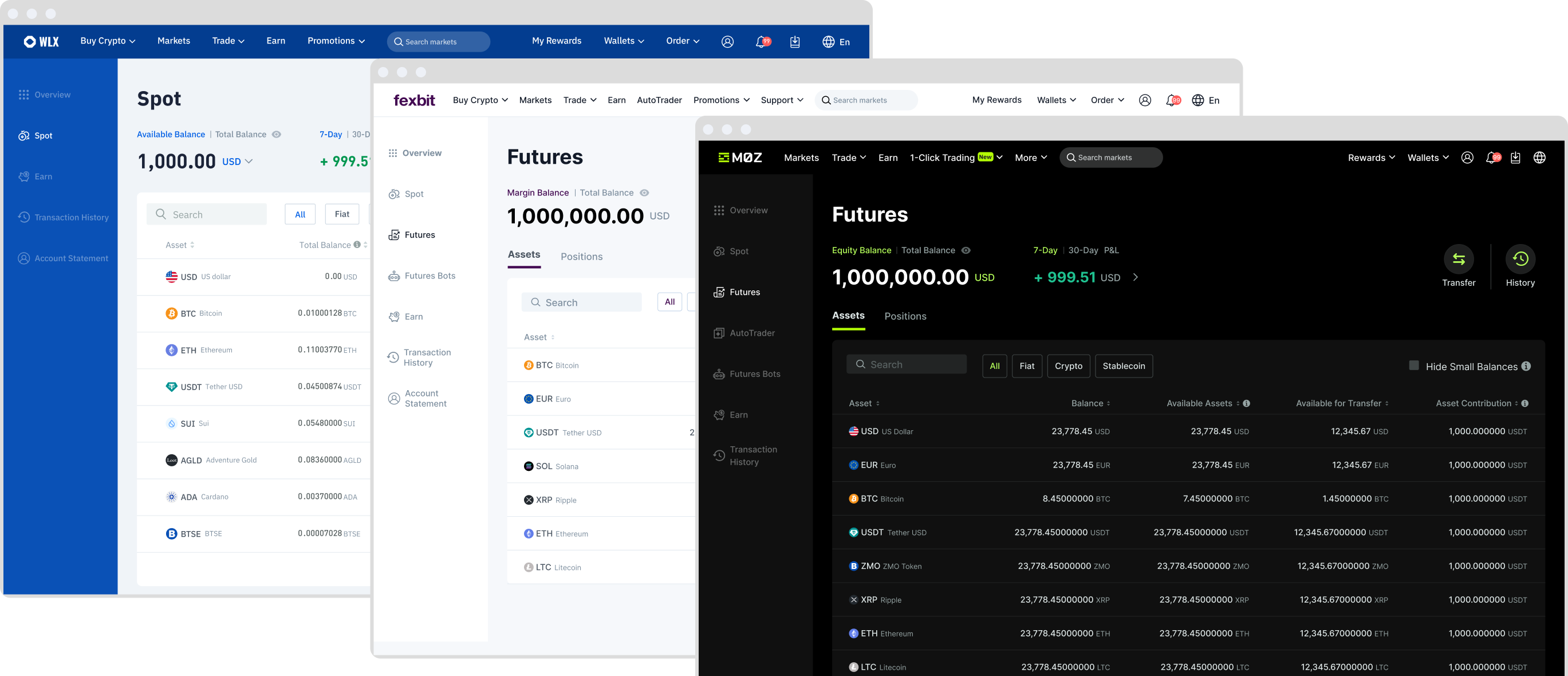
One Foundation, Multiple Exchanges
An exchange is a connected product journey. Users create an account, add funds, trade, and manage assets. Each step introduces different product features, and those features need to stay consistent across Web and App.
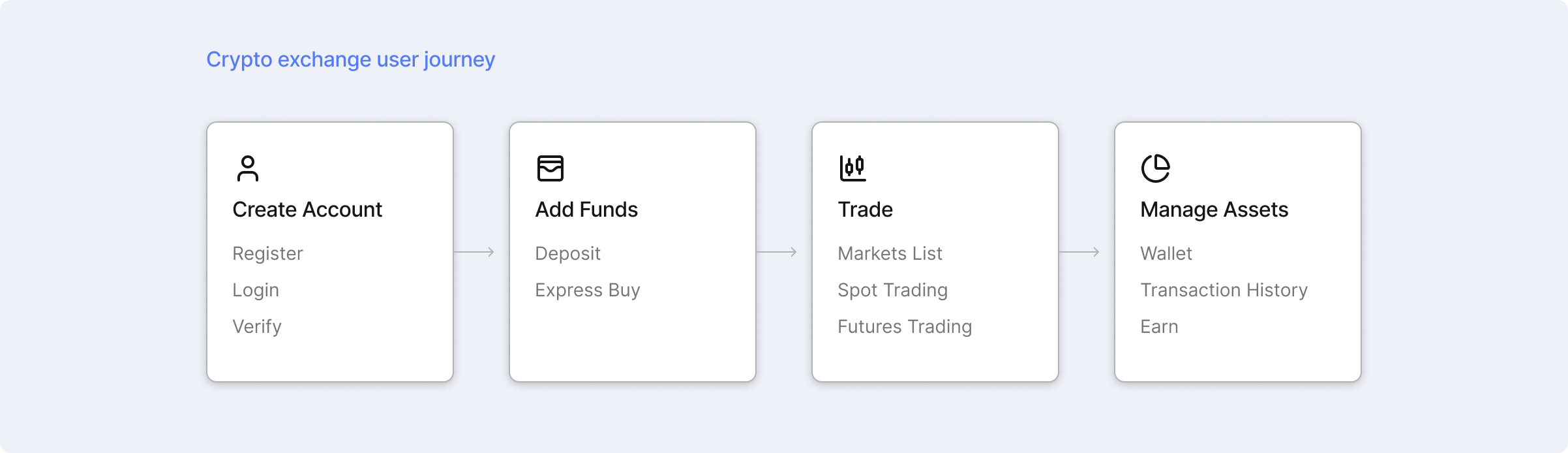
To launch each client exchange without rebuilding this journey from scratch, we started from the same product foundation and applied each client’s requirements across it.
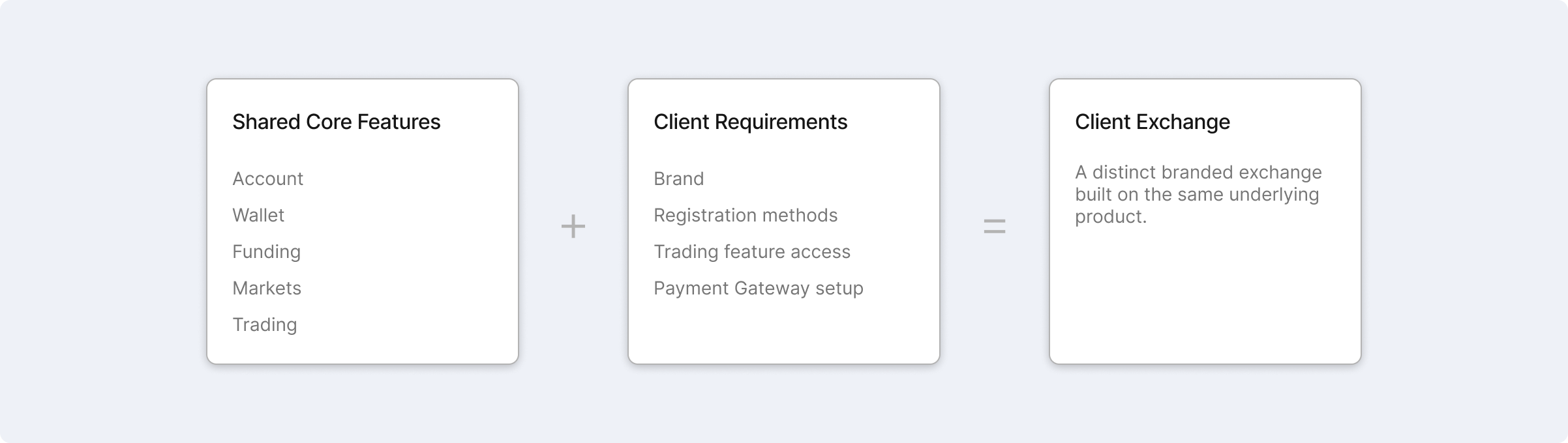
Making Client Delivery Repeatable
Early client work often started by adapting the previous implementation. As the client base grew, templates drifted, product differences were confirmed too late, and the line between standard and custom work became unclear.
The problem was no longer how to customize the next client, but how to make recurring client delivery more repeatable.
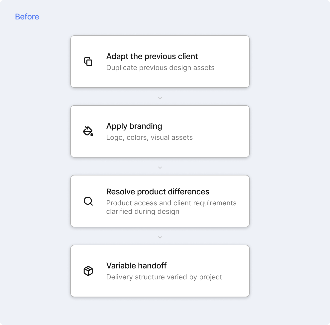
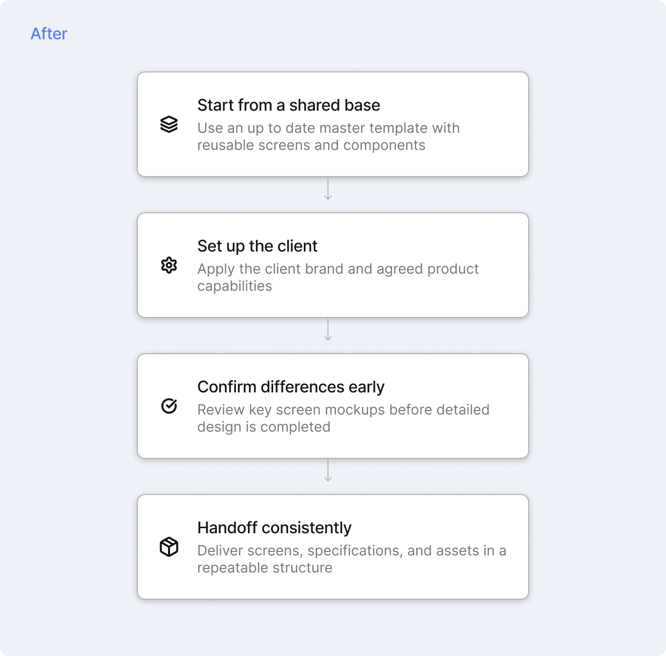
Standard design preparation became faster as the shared model matured.
I helped establish a shared design base with reusable components, client templates, asset guidelines, clearer review points, and more consistent handoff practices.
Deciding Where Differences Belong
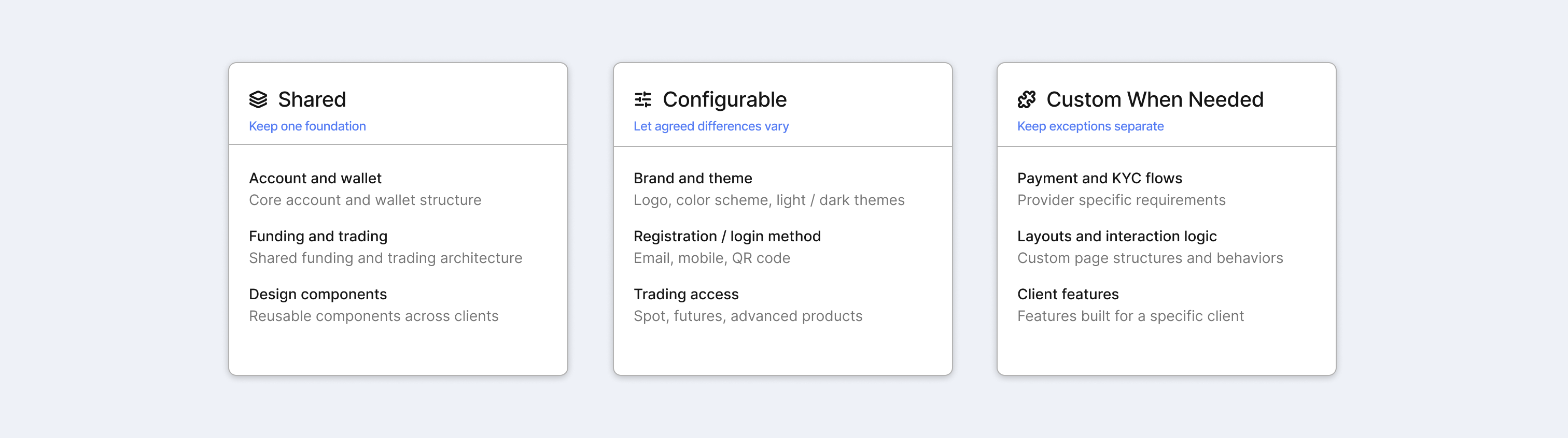
As client requirements expanded, the challenge shifted from supporting every request to defining which differences should become platform rules and which were better kept separate.

Shared
Keep one foundation
Account and walletCore account and wallet structure
Funding and tradingShared funding and trading architecture
Design componentsReusable components across clients

Configurable
Let agreed differences vary
Brand and themeLogo, color scheme, light / dark themes
Registration / login methodEmail, mobile, QR code
Trading accessSpot, futures, advanced products

Custom When Needed
Keep exceptions separate
Payment and KYC flowsProvider specific requirements
Layouts and interaction logicCustom page structures and behaviors
Client featuresFeatures built for a specific client
The goal was to support meaningful client differences without turning every request into a new platform rule.
How Configuration Changes the Product
A configurable option rarely affected just one screen. Changes to account access could also affect verification, account data, security, and App behavior.
Account Access Was Not an Isolated Option
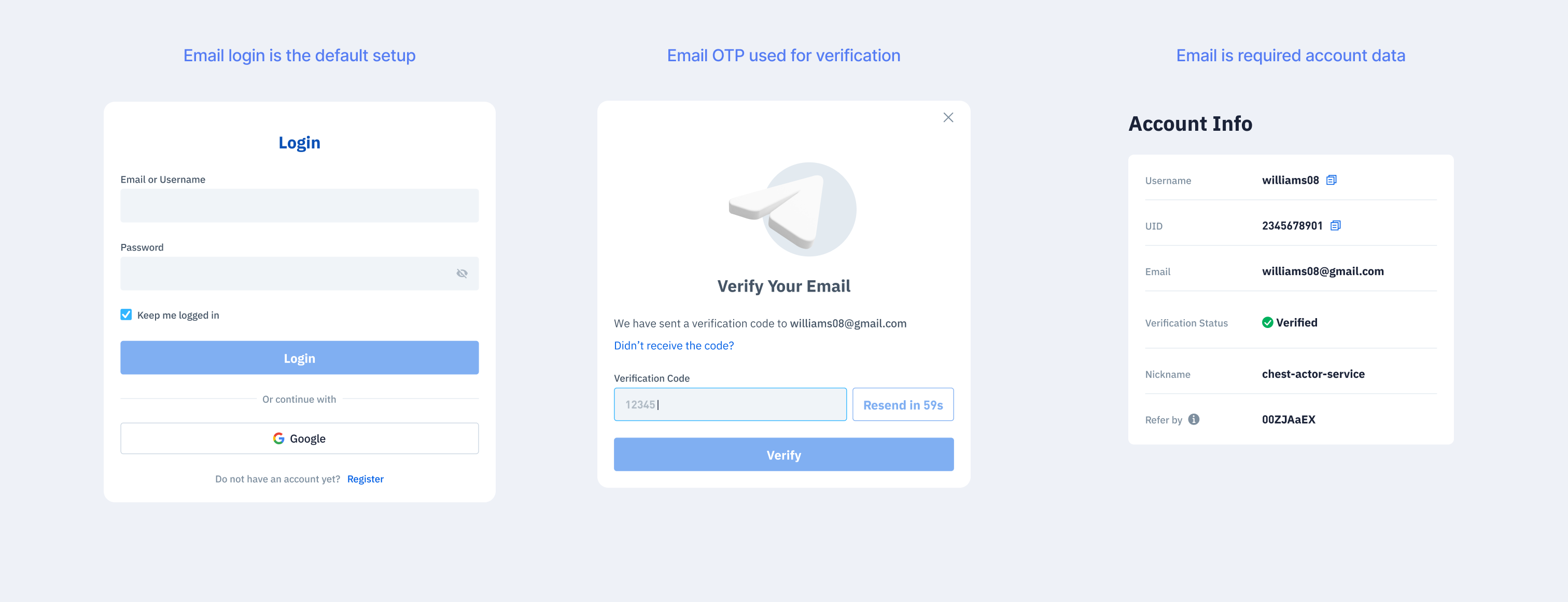
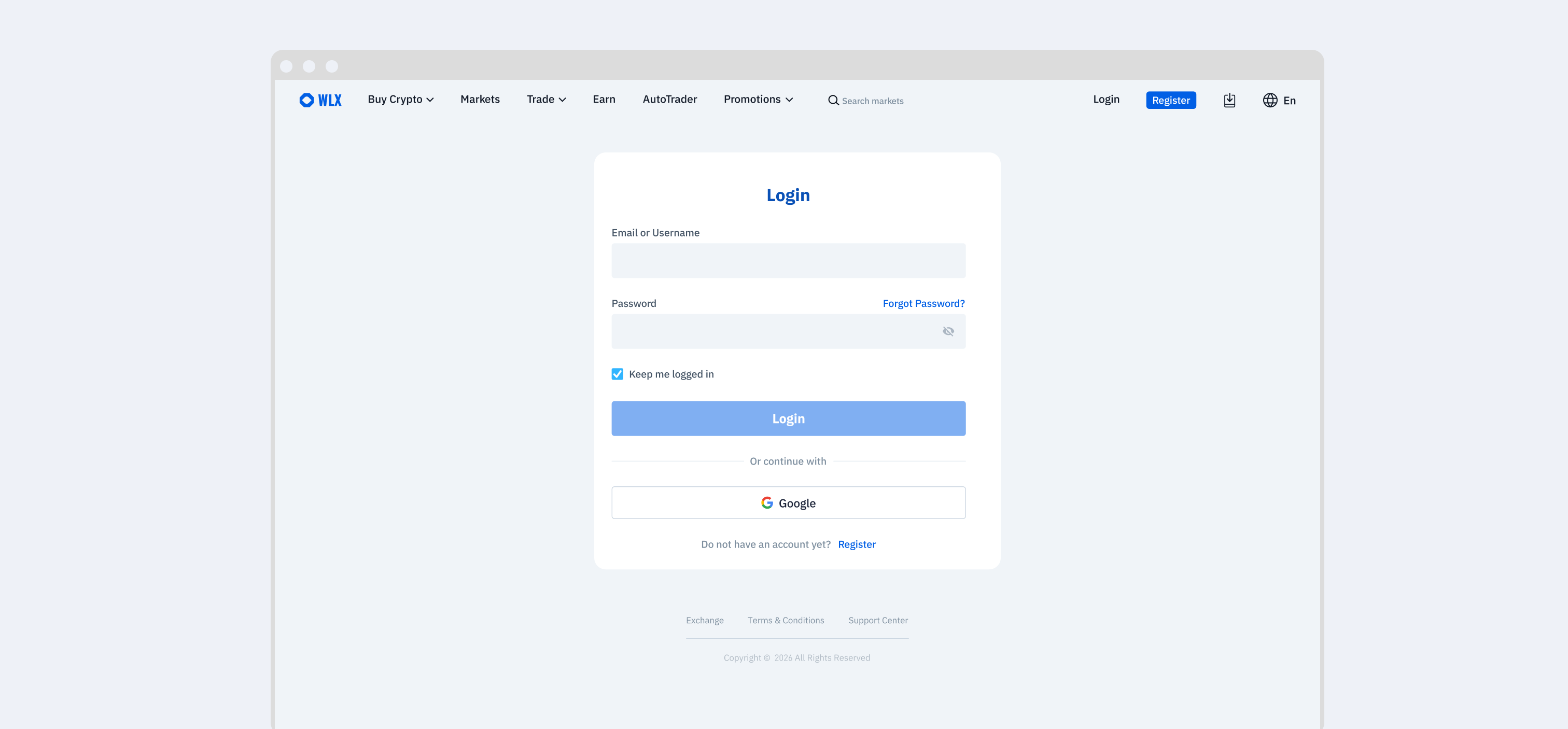
Email and mobile could be used for account registration, while login also supported QR code. These choices affected verification, account data, and App behavior across the product.
Default Email setup
Mobile Enabled
QR Code Enabled
Trading Access Changed More Than the Trading Screen
Different trading packages changed which products users could access. The same decision also needed to stay consistent across navigation, Markets, Wallet, and App surfaces.
Spot Access
Futures Access
Full Access
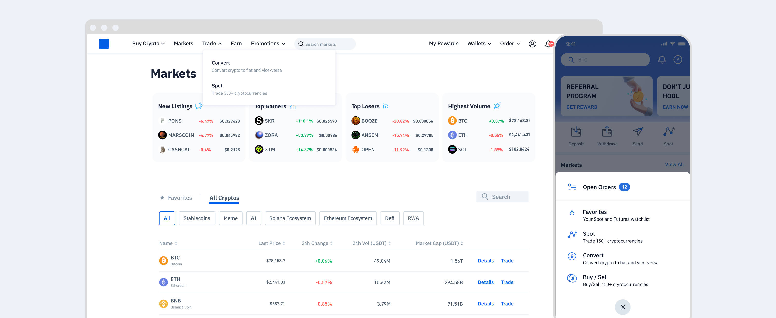
A single configuration could affect multiple parts of the product. Keeping those dependencies aligned was essential to maintaining a consistent experience across Web and App.
Building a Flexible Theme System
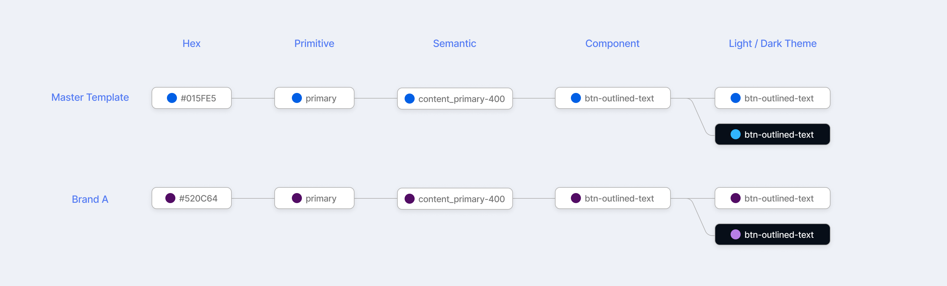
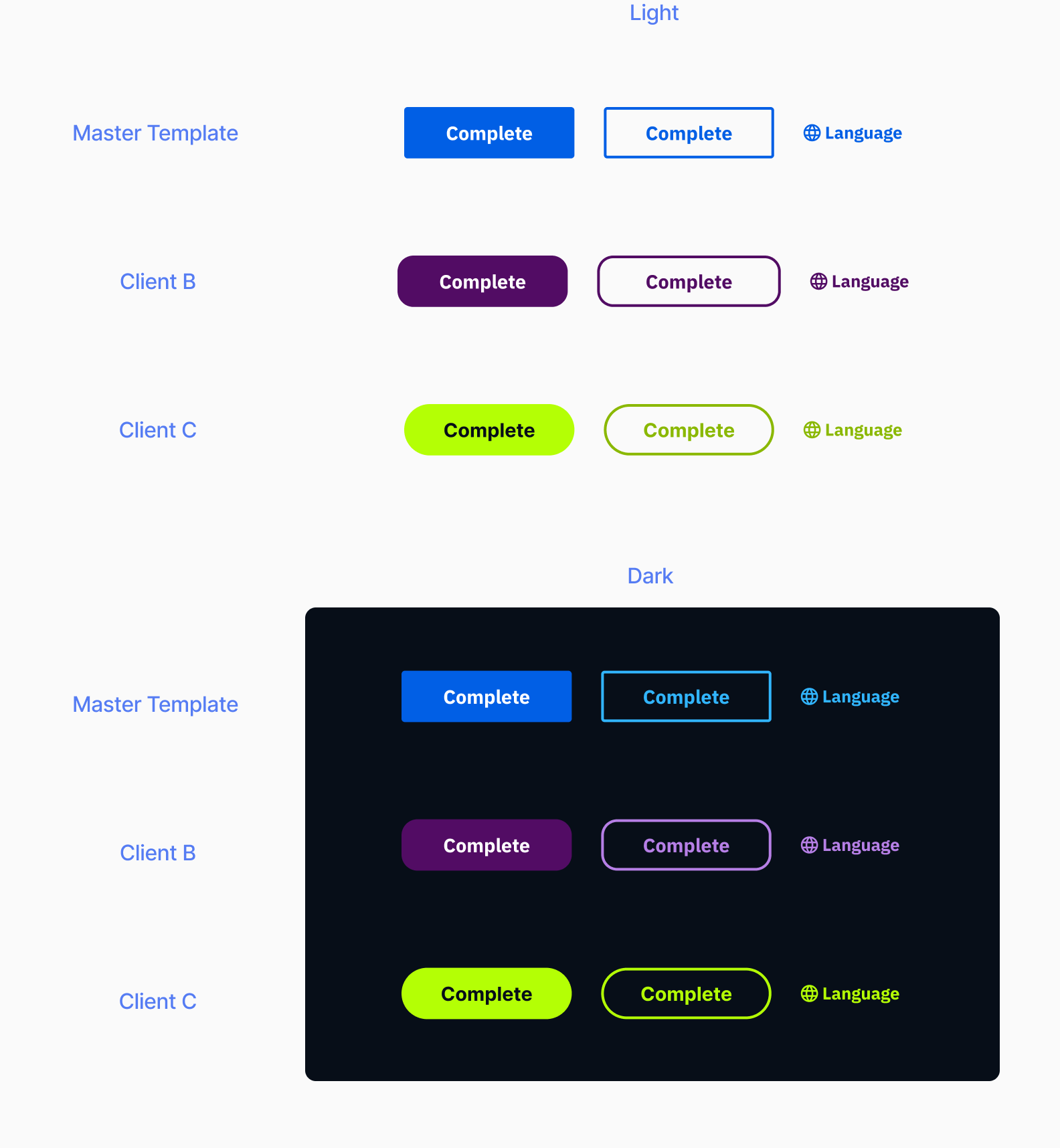
The platform inherited an existing color foundation, but more client brands and light / dark modes made direct color mapping harder to maintain. A layered token structure separated raw color values, product meaning, component roles, and theme output, making variation easier to manage across brands and modes.
One System, Multiple Outputs
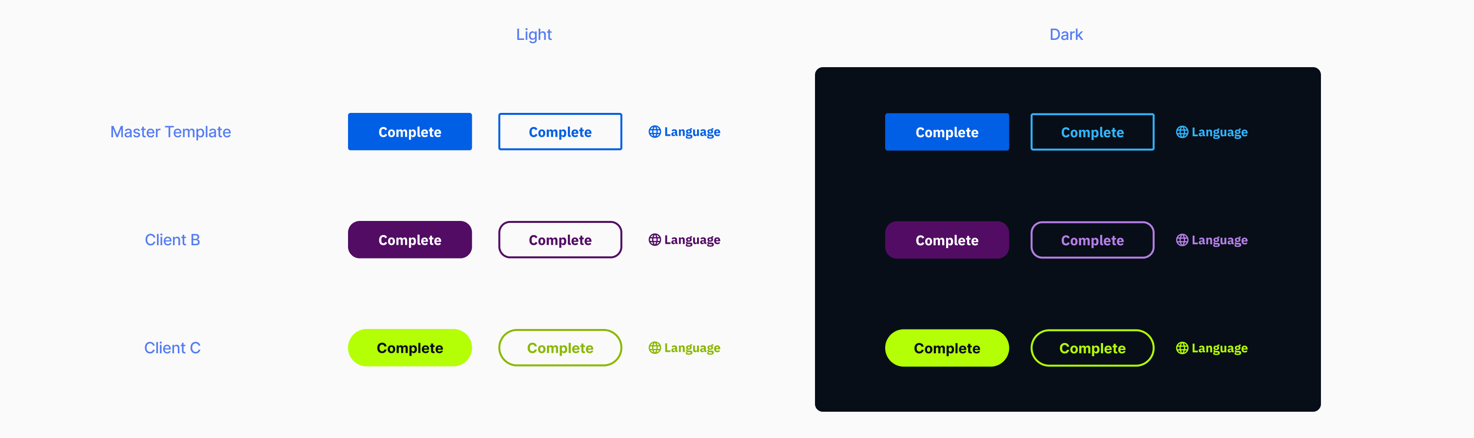
Primary buttons, outlined buttons, and text links shared the same component foundation across brands. Brand styling could then adjust color, typography, and selected visual details such as corner radius, while light and dark modes remained supported through the same system.
Design + Frontend Alignment
The initial dark mode mapping and token structure were prototyped in design, then refined with frontend to align token naming and mapping between Figma and production.
The goal was not simply to add dark mode. It was to create a theme structure where brand identity and appearance mode could change independently while the underlying component logic stayed shared.
One Platform, Different Client Products
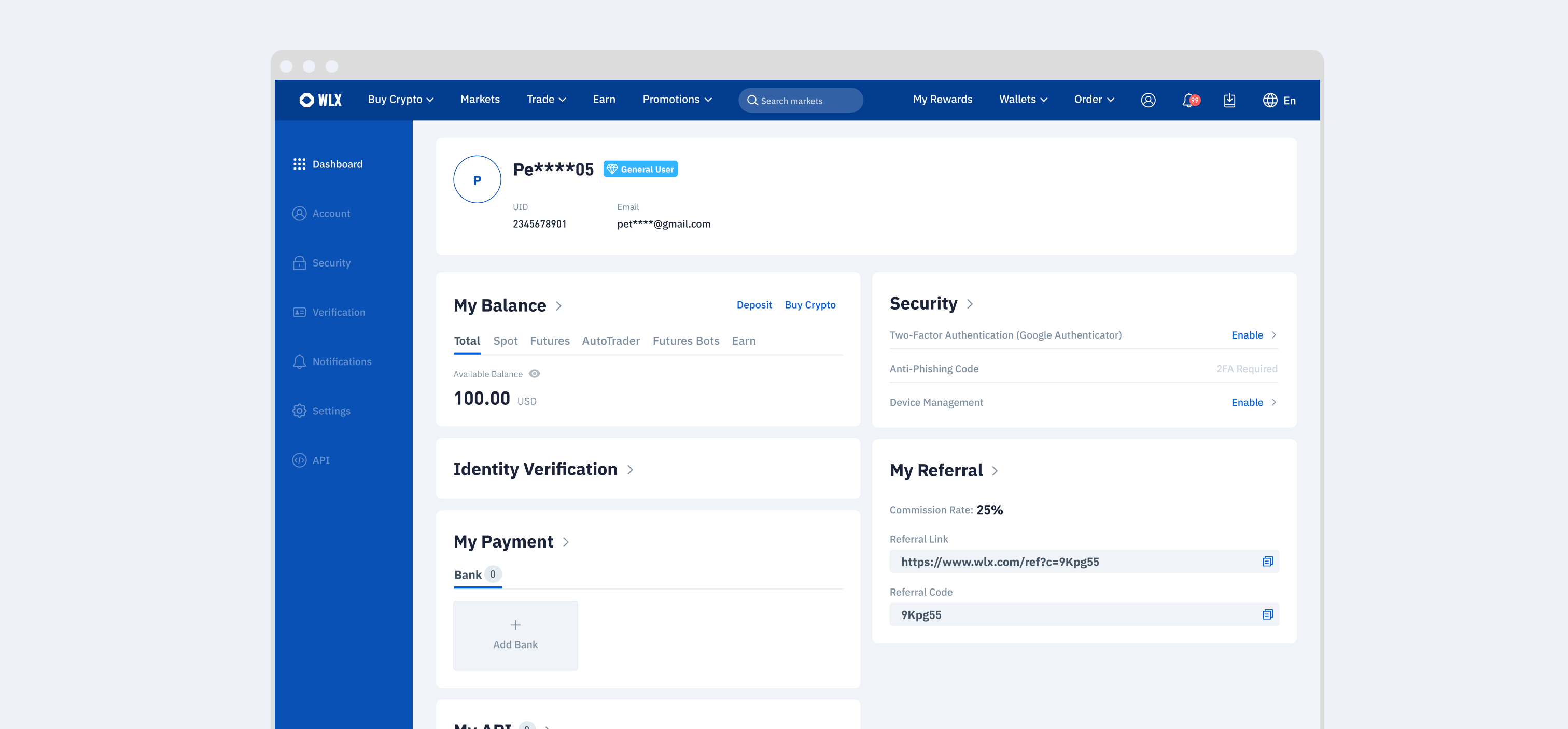
The same platform foundation was reused across key product areas, while selected capabilities, access rules, and presentation could vary by client. Switching between clients shows which parts of the experience stayed consistent and where the product adapted to different requirements.
Client A
Closer to shared base, spot trading access only
Client B
Moderate customization, crypto asset access only
Client C
Highly customized internal brand, dark theme
Login
Client A
Client B
Client C
Account
Client A
Client B
Client C
Wallet & Earn
Client A
Client B
Client C
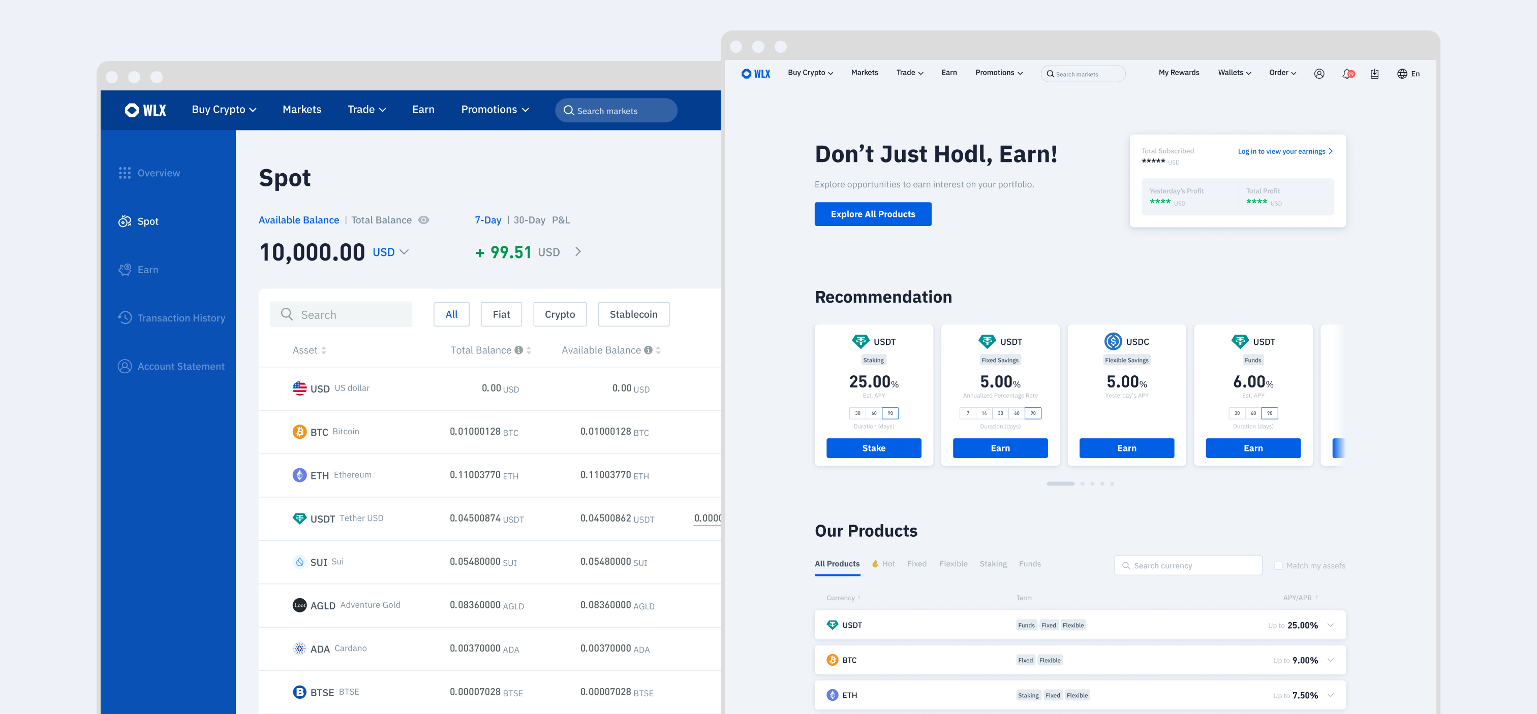
The result was not one fixed exchange template, but a shared product foundation that could support meaningfully different client products without rebuilding the core experience each time.
Moving Design Upstream
As the platform matured, design became involved earlier in client onboarding and scope alignment. Instead of receiving largely defined requirements, design increasingly helped clarify product boundaries, surface exceptions, and align implementation needs before detailed design began.
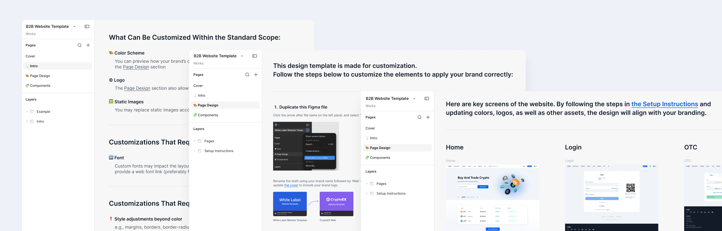
Client Facing Figma Template
A client facing Figma template gave clients a concrete view of the standard product before detailed design began. BD could use the same file during onboarding to collect brand assets and requirements, clarify what was standard, identify work that needed further evaluation, and flag requests that required separate quotation.
Clients could preview key screens, apply their logo and brand colors, then return the file with their inputs. The completed template became a shared reference for BD, the client, PM, and design during requirement collection and kickoff.
Impact: A Shared Working Model
BD + Design
Align scope earlier
Client needs became visible before detailed design, making standard and custom work easier to discuss.
Product + Design
Turn recurring needs into rules
Repeated client requests could be reviewed as shared platform decisions instead of being solved project by project.
Frontend + Design
Align design & implementation
Reusable components, theme logic, and implementation patterns were coordinated more closely between design and production.
4 Days
→
Under 1 Day
Standard design preparation became progressively faster.
Under 1 Week
Fastest standard client implementation from signing to production.
20+ Clients
The shared platform supported more than 20 client exchanges over time.
Design moved from receiving client requirements downstream to helping shape how those requirements were defined, reviewed, and handed off.
More case studies?

Let’s work together.


Scaling a B2B
Exchange Platform
A B2B exchange platform gives businesses the core product needed to launch their own branded crypto exchange across web and app. My work focused on turning recurring client customization into a more reusable product foundation.
Role
Product Designer → Lead Designer
Platform
Web · App
Scope
Product architecture · Client configuration · Design systems · Delivery model
One Foundation, Multiple Exchanges
An exchange is a connected product journey. Users create an account, add funds, trade, and manage assets. Each step introduces different product features, and those features need to stay consistent across Web and App.
To launch each client exchange without rebuilding this journey from scratch, we started from the same product foundation and applied each client’s requirements across it.
Making Client Delivery Repeatable
Early client work often started by adapting the previous implementation. As the client base grew, templates drifted, product differences were confirmed too late, and the line between standard and custom work became unclear.
The problem was no longer how to customize the next client, but how to make recurring client delivery more repeatable.
Standard design preparation became faster as the shared model matured.
I helped establish a shared design base with reusable components, client templates, asset guidelines, clearer review points, and more consistent handoff practices.
Deciding Where Differences Belong
As client requirements expanded, the challenge shifted from supporting every request to defining which differences should become platform rules and which were better kept separate.
The goal was to support meaningful client differences without turning every request into a new platform rule.
How Configuration Changes the Product
A configurable option rarely affected just one screen. Changes to account access could also affect verification, account data, security, and App behavior.
Account Access Was Not an Isolated Option
Email and mobile could be used for account registration, while login also supported QR code. These choices affected verification, account data, and App behavior across the product.
Default Email setup
Mobile Enabled
QR Code Enabled
Trading Access Changed More Than the Trading Screen
Different trading packages changed which products users could access. The same decision also needed to stay consistent across navigation, Markets, Wallet, and App surfaces.
Spot Access
Futures Access
Full Access
A single configuration could affect multiple parts of the product. Keeping those dependencies aligned was essential to maintaining a consistent experience across Web and App.
Building a Flexible Theme System
The platform inherited an existing color foundation, but more client brands and light / dark modes made direct color mapping harder to maintain. A layered token structure separated raw color values, product meaning, component roles, and theme output, making variation easier to manage across brands and modes.
One System, Multiple Outputs
Primary buttons, outlined buttons, and text links shared the same component foundation across brands. Brand styling could then adjust color, typography, and selected visual details such as corner radius, while light and dark modes remained supported through the same system.
Design + Frontend Alignment
The initial dark mode mapping and token structure were prototyped in design, then refined with frontend to align token naming and mapping between Figma and production.
The goal was not simply to add dark mode. It was to create a theme structure where brand identity and appearance mode could change independently while the underlying component logic stayed shared.
One Platform, Different Client Products
The same platform foundation was reused across key product areas, while selected capabilities, access rules, and presentation could vary by client. Switching between clients shows which parts of the experience stayed consistent and where the product adapted to different requirements.
Client A
Closer to shared base, spot trading access only
Client B
Moderate customization, crypto asset access only
Client C
Highly customized internal brand, dark theme
Login
Client A
Client B
Client C
Account
Client A
Client B
Client C
Wallet & Earn
Client A
Client B
Client C
The result was not one fixed exchange template, but a shared product foundation that could support meaningfully different client products without rebuilding the core experience each time.
Moving Design Upstream
As the platform matured, design became involved earlier in client onboarding and scope alignment. Instead of receiving largely defined requirements, design increasingly helped clarify product boundaries, surface exceptions, and align implementation needs before detailed design began.
Client Facing Figma Template
A client facing Figma template gave clients a concrete view of the standard product before detailed design began. BD could use the same file during onboarding to collect brand assets and requirements, clarify what was standard, identify work that needed further evaluation, and flag requests that required separate quotation.
Clients could preview key screens, apply their logo and brand colors, then return the file with their inputs. The completed template became a shared reference for BD, the client, PM, and design during requirement collection and kickoff.
Impact: A Shared Working Model
BD + Design
Align scope earlier
Client needs became visible before detailed design, making standard and custom work easier to discuss.
Product + Design
Turn recurring needs into rules
Repeated client requests could be reviewed as shared platform decisions instead of being solved project by project.
Frontend + Design
Align design & implementation
Reusable components, theme logic, and implementation patterns were coordinated more closely between design and production.
4 Days
→
Under 1 Day
Standard design preparation became progressively faster.
Under 1 Week
Fastest standard client implementation from signing to production.
20+ Clients
The shared platform supported more than 20 client exchanges over time.
Design moved from receiving client requirements downstream to helping shape how those requirements were defined, reviewed, and handed off.
More case studies?
Let’s work together.
Scaling a B2B
Exchange Platform
A B2B exchange platform gives businesses the core product needed to launch their own branded crypto exchange across web and app. My work focused on turning recurring client customization into a more reusable product foundation.
Role
Product Designer → Lead Designer
Platform
Web · App
Scope
Product architecture · Client configuration · Design systems · Delivery model
One Foundation, Multiple Exchanges
An exchange is a connected product journey. Users create an account, add funds, trade, and manage assets. Each step introduces different product features, and those features need to stay consistent across Web and App.
To launch each client exchange without rebuilding this journey from scratch, we started from the same product foundation and applied each client’s requirements across it.
Making Client Delivery Repeatable
Early client work often started by adapting the previous implementation. As the client base grew, templates drifted, product differences were confirmed too late, and the line between standard and custom work became unclear.
The problem was no longer how to customize the next client, but how to make recurring client delivery more repeatable.
Standard design preparation became faster as the shared model matured.
I helped establish a shared design base with reusable components, client templates, asset guidelines, clearer review points, and more consistent handoff practices.
Deciding Where Differences Belong
As client requirements expanded, the challenge shifted from supporting every request to defining which differences should become platform rules and which were better kept separate.
The goal was to support meaningful client differences without turning every request into a new platform rule.
How Configuration Changes the Product
A configurable option rarely affected just one screen. Changes to account access could also affect verification, account data, security, and App behavior.
Account Access Was Not an Isolated Option
Email and mobile could be used for account registration, while login also supported QR code. These choices affected verification, account data, and App behavior across the product.
Default Email setup
Mobile Enabled
QR Code Enabled
Trading Access Changed More Than the Trading Screen
Different trading packages changed which products users could access. The same decision also needed to stay consistent across navigation, Markets, Wallet, and App surfaces.
Spot Access
Futures Access
Full Access
A single configuration could affect multiple parts of the product. Keeping those dependencies aligned was essential to maintaining a consistent experience across Web and App.
Building a Flexible Theme System
The platform inherited an existing color foundation, but more client brands and light / dark modes made direct color mapping harder to maintain. A layered token structure separated raw color values, product meaning, component roles, and theme output, making variation easier to manage across brands and modes.
One System, Multiple Outputs
Primary buttons, outlined buttons, and text links shared the same component foundation across brands. Brand styling could then adjust color, typography, and selected visual details such as corner radius, while light and dark modes remained supported through the same system.
Design + Frontend Alignment
The initial dark mode mapping and token structure were prototyped in design, then refined with frontend to align token naming and mapping between Figma and production.
The goal was not simply to add dark mode. It was to create a theme structure where brand identity and appearance mode could change independently while the underlying component logic stayed shared.
One Platform, Different Client Products
The same platform foundation was reused across key product areas, while selected capabilities, access rules, and presentation could vary by client. Switching between clients shows which parts of the experience stayed consistent and where the product adapted to different requirements.
Client A
Closer to shared base, spot trading access only
Client B
Moderate customization, crypto asset access only
Client C
Highly customized internal brand, dark theme
Login
Client A
Client B
Client C
Account
Client A
Client B
Client C
Wallet & Earn
Client A
Client B
Client C
The result was not one fixed exchange template, but a shared product foundation that could support meaningfully different client products without rebuilding the core experience each time.
Moving Design Upstream
As the platform matured, design became involved earlier in client onboarding and scope alignment. Instead of receiving largely defined requirements, design increasingly helped clarify product boundaries, surface exceptions, and align implementation needs before detailed design began.
Client Facing Figma Template
A client facing Figma template gave clients a concrete view of the standard product before detailed design began. BD could use the same file during onboarding to collect brand assets and requirements, clarify what was standard, identify work that needed further evaluation, and flag requests that required separate quotation.
Clients could preview key screens, apply their logo and brand colors, then return the file with their inputs. The completed template became a shared reference for BD, the client, PM, and design during requirement collection and kickoff.
Impact: A Shared Working Model
BD + Design
Align scope earlier
Client needs became visible before detailed design, making standard and custom work easier to discuss.
Product + Design
Turn recurring needs into rules
Repeated client requests could be reviewed as shared platform decisions instead of being solved project by project.
Frontend + Design
Align design & implementation
Reusable components, theme logic, and implementation patterns were coordinated more closely between design and production.
4 Days
→
Under 1 Day
Standard design preparation became progressively faster.
Under 1 Week
Fastest standard client implementation from signing to production.
20+ Clients
The shared platform supported more than 20 client exchanges over time.
Design moved from receiving client requirements downstream to helping shape how those requirements were defined, reviewed, and handed off.
More case studies?
Let’s work together.
Scaling a B2B
Exchange Platform
A B2B exchange platform gives businesses the core product needed to launch their own branded crypto exchange across web and app. My work focused on turning recurring client customization into a more reusable product foundation.
Role
Product Designer → Lead Designer
Platform
Web · App
Scope
Product architecture · Client configuration · Design systems · Delivery model
One Foundation, Multiple Exchanges
An exchange is a connected product journey. Users create an account, add funds, trade, and manage assets. Each step introduces different product features, and those features need to stay consistent across Web and App.
To launch each client exchange without rebuilding this journey from scratch, we started from the same product foundation and applied each client’s requirements across it.
Making Client Delivery Repeatable
Early client work often started by adapting the previous implementation. As the client base grew, templates drifted, product differences were confirmed too late, and the line between standard and custom work became unclear.
The problem was no longer how to customize the next client, but how to make recurring client delivery more repeatable.
Standard design preparation became faster as the shared model matured.
I helped establish a shared design base with reusable components, client templates, asset guidelines, clearer review points, and more consistent handoff practices.
Deciding Where Differences Belong
As client requirements expanded, the challenge shifted from supporting every request to defining which differences should become platform rules and which were better kept separate.
The goal was to support meaningful client differences without turning every request into a new platform rule.
How Configuration Changes the Product
A configurable option rarely affected just one screen. Changes to account access could also affect verification, account data, security, and App behavior.
Account Access Was Not an Isolated Option
Email and mobile could be used for account registration, while login also supported QR code. These choices affected verification, account data, and App behavior across the product.
Default Email setup
Mobile Enabled
QR Code Enabled
Trading Access Changed More Than the Trading Screen
Different trading packages changed which products users could access. The same decision also needed to stay consistent across navigation, Markets, Wallet, and App surfaces.
Spot Access
Futures Access
Full Access
A single configuration could affect multiple parts of the product. Keeping those dependencies aligned was essential to maintaining a consistent experience across Web and App.
Building a Flexible Theme System
The platform inherited an existing color foundation, but more client brands and light / dark modes made direct color mapping harder to maintain. A layered token structure separated raw color values, product meaning, component roles, and theme output, making variation easier to manage across brands and modes.
One System, Multiple Outputs
Primary buttons, outlined buttons, and text links shared the same component foundation across brands. Brand styling could then adjust color, typography, and selected visual details such as corner radius, while light and dark modes remained supported through the same system.
Design + Frontend Alignment
The initial dark mode mapping and token structure were prototyped in design, then refined with frontend to align token naming and mapping between Figma and production.
The goal was not simply to add dark mode. It was to create a theme structure where brand identity and appearance mode could change independently while the underlying component logic stayed shared.
One Platform, Different Client Products
The same platform foundation was reused across key product areas, while selected capabilities, access rules, and presentation could vary by client. Switching between clients shows which parts of the experience stayed consistent and where the product adapted to different requirements.
Client A
Closer to shared base, spot trading access only
Client B
Moderate customization, crypto asset access only
Client C
Highly customized internal brand, dark theme
Login
Client A
Client B
Client C
Account
Client A
Client B
Client C
Wallet & Earn
Client A
Client B
Client C
The result was not one fixed exchange template, but a shared product foundation that could support meaningfully different client products without rebuilding the core experience each time.
Moving Design Upstream
As the platform matured, design became involved earlier in client onboarding and scope alignment. Instead of receiving largely defined requirements, design increasingly helped clarify product boundaries, surface exceptions, and align implementation needs before detailed design began.
Client Facing Figma Template
A client facing Figma template gave clients a concrete view of the standard product before detailed design began. BD could use the same file during onboarding to collect brand assets and requirements, clarify what was standard, identify work that needed further evaluation, and flag requests that required separate quotation.
Clients could preview key screens, apply their logo and brand colors, then return the file with their inputs. The completed template became a shared reference for BD, the client, PM, and design during requirement collection and kickoff.
Impact: A Shared Working Model
BD + Design
Align scope earlier
Client needs became visible before detailed design, making standard and custom work easier to discuss.
Product + Design
Turn recurring needs into rules
Repeated client requests could be reviewed as shared platform decisions instead of being solved project by project.
Frontend + Design
Align design & implementation
Reusable components, theme logic, and implementation patterns were coordinated more closely between design and production.
4 Days
→
Under 1 Day
Standard design preparation became progressively faster.
Under 1 Week
Fastest standard client implementation from signing to production.
20+ Clients
The shared platform supported more than 20 client exchanges over time.
Design moved from receiving client requirements downstream to helping shape how those requirements were defined, reviewed, and handed off.
More case studies?
Let’s work together.
Scaling a B2B
Exchange Platform
A B2B exchange platform gives businesses the core product needed to launch their own branded crypto exchange across web and app. My work focused on turning recurring client customization into a more reusable product foundation.
Role
Product Designer → Lead Designer
Platform
Web · App
Scope
Product architecture · Client configuration · Design systems · Delivery model
One Foundation, Multiple Exchanges
An exchange is a connected product journey. Users create an account, add funds, trade, and manage assets. Each step introduces different product features, and those features need to stay consistent across Web and App.
To launch each client exchange without rebuilding this journey from scratch, we started from the same product foundation and applied each client’s requirements across it.
Making Client Delivery Repeatable
Early client work often started by adapting the previous implementation. As the client base grew, templates drifted, product differences were confirmed too late, and the line between standard and custom work became unclear.
The problem was no longer how to customize the next client, but how to make recurring client delivery more repeatable.
Standard design preparation became faster as the shared model matured.
I helped establish a shared design base with reusable components, client templates, asset guidelines, clearer review points, and more consistent handoff practices.
Deciding Where Differences Belong
As client requirements expanded, the challenge shifted from supporting every request to defining which differences should become platform rules and which were better kept separate.
The goal was to support meaningful client differences without turning every request into a new platform rule.
How Configuration Changes the Product
A configurable option rarely affected just one screen. Changes to account access could also affect verification, account data, security, and App behavior.
Account Access Was Not an Isolated Option
Email and mobile could be used for account registration, while login also supported QR code. These choices affected verification, account data, and App behavior across the product.
Default Email setup
Mobile Enabled
QR Code Enabled
Trading Access Changed More Than the Trading Screen
Different trading packages changed which products users could access. The same decision also needed to stay consistent across navigation, Markets, Wallet, and App surfaces.
Spot Access
Futures Access
Full Access
A single configuration could affect multiple parts of the product. Keeping those dependencies aligned was essential to maintaining a consistent experience across Web and App.
Building a Flexible Theme System
The platform inherited an existing color foundation, but more client brands and light / dark modes made direct color mapping harder to maintain. A layered token structure separated raw color values, product meaning, component roles, and theme output, making variation easier to manage across brands and modes.
One System, Multiple Outputs
Primary buttons, outlined buttons, and text links shared the same component foundation across brands. Brand styling could then adjust color, typography, and selected visual details such as corner radius, while light and dark modes remained supported through the same system.
Design + Frontend Alignment
The initial dark mode mapping and token structure were prototyped in design, then refined with frontend to align token naming and mapping between Figma and production.
The goal was not simply to add dark mode. It was to create a theme structure where brand identity and appearance mode could change independently while the underlying component logic stayed shared.
One Platform, Different Client Products
The same platform foundation was reused across key product areas, while selected capabilities, access rules, and presentation could vary by client. Switching between clients shows which parts of the experience stayed consistent and where the product adapted to different requirements.
Client A
Closer to shared base, spot trading access only
Client B
Moderate customization, crypto asset access only
Client C
Highly customized internal brand, dark theme
Login
Client A
Client B
Client C
Account
Client A
Client B
Client C
Wallet & Earn
Client A
Client B
Client C
The result was not one fixed exchange template, but a shared product foundation that could support meaningfully different client products without rebuilding the core experience each time.
Moving Design Upstream
As the platform matured, design became involved earlier in client onboarding and scope alignment. Instead of receiving largely defined requirements, design increasingly helped clarify product boundaries, surface exceptions, and align implementation needs before detailed design began.
Client Facing Figma Template
A client facing Figma template gave clients a concrete view of the standard product before detailed design began. BD could use the same file during onboarding to collect brand assets and requirements, clarify what was standard, identify work that needed further evaluation, and flag requests that required separate quotation.
Clients could preview key screens, apply their logo and brand colors, then return the file with their inputs. The completed template became a shared reference for BD, the client, PM, and design during requirement collection and kickoff.
Impact: A Shared Working Model
BD + Design
Align scope earlier
Client needs became visible before detailed design, making standard and custom work easier to discuss.
Product + Design
Turn recurring needs into rules
Repeated client requests could be reviewed as shared platform decisions instead of being solved project by project.
Frontend + Design
Align design & implementation
Reusable components, theme logic, and implementation patterns were coordinated more closely between design and production.
4 Days
→
Under 1 Day
Standard design preparation became progressively faster.
Under 1 Week
Fastest standard client implementation from signing to production.
20+ Clients
The shared platform supported more than 20 client exchanges over time.
Design moved from receiving client requirements downstream to helping shape how those requirements were defined, reviewed, and handed off.
More case studies?
Let’s work together.